Boutique Butterfly

Aloha,

Minimalism coupled with sketched lines are the details that inspired this butterfly card from the AECP course Clean & Simple Boutique Cards.

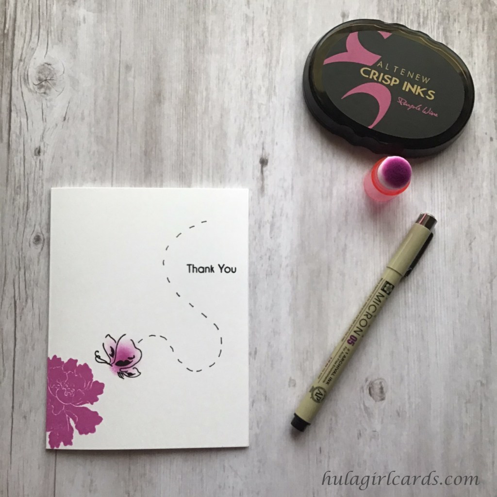
This monochromatic card features an ornate flower and sketched butterfly from Altenew’s Lacy Scrolls and Painted Butterflies stamp sets respectively. The blossom, only partially stamped on the card front with Altenew’s Purple Wine dye ink, sits in the lower left corner. By stamping off the edge of the card, the flower’s rarity is emphasized, while also creating a plethora of white space in which the butterfly can travel.

Though Painted Butterflies is a layering stamp set, only a medium outline image of a butterfly in profile was needed for this card. The sketched look of the butterfly’s contours lends itself to the boutique aesthetic of clean lines with a hand-drawn look. Instead of stamping the interior layers, Purple Wine was lightly applied within the outline with an I-Crafter’s blending brush. Using such a small brush made creating a focal point along the center of the butterfly easy to achieve. Brushing repeatedly with soft, concentric circles intensified the color near the implied body line of the butterfly and also gradated the color to a whisper of a tint at the outer wings.

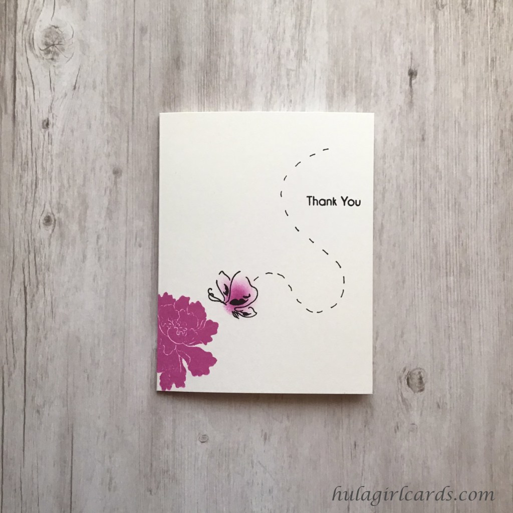
Finishing details for this card include a curving, hand-drawn flight path around the “thank you” sentiment, the latter of which is another example of partial stamping. A Post-It note was used to cover the “so much” in Altenew’s Parrot Paradise’s “thank you so much” sentiment before inking the stamp with Altenew’s Obsidian Black Pigment Ink. Then, the paper was removed prior to stamping the inked sentiment. Like the blossom, the truncated sentiment leaves a maximum of room for the butterfly’s flight.

The search for the perfect flower, evidenced by the flight path, drawn with a black Micron pigment pen, builds drama in this scene. When the butterfly finally finds the flower for which it has been searching and begins to eat its nectar, one might imagine the butterfly’s color transforming from limpid and pale to vibrant as that nourishment courses through the winged creature’s system. The blended gradation from intense to soft underscores this imagery and helps the search and its culmination coincide beautifully with the sentiment’s expression of gratitude.

Mahalo!

Hello, Lovely, You Inspire Me!

Aloha,

Sometimes, a card takes a romantic turn, leaving botanical accuracy in its wake. Such was the case with today’s card, inspired by the AECP course All About Layering 2, with its fuchsia blossoms and buds nestled amongst vining leaves.

A large, focal vine, from Altenew’s Baroque Motifs stamp set, grounds this card with its elegantly swirling leaves, bejeweled with fuchsia. Gina K. Design’s Masking Magic was used to protect the stamped image so background depth could be created with flowers seemingly winking from behind leaves. When adding the flowers, the outline image was stamped in Simon Says Stamp’s Intense Black Ink. Though the subsequent layer placement was easy to achieve, the stamps were positioned and tested on a sheet of laminated plastic prior to stamping. These bold flowers, stamped in pinks and purples from Altenew’s Rose Petal and Enchanted Garden color families respectively, are offset by the vine’s deep green hue of Altenew’s Shadow Creek ink.

For the lighter colorway, secondary stamping featured prevalently in the vines and flowers. In order to protect both cards with masking without needing to stamp and cut a second mask, the release paper from the first card was used. Tombow’s Mono Multi Liquid Glue is repositionable when allowed to air dry. This adhesive was applied to the release paper and then carefully adhered to the card. Because this glue has more tack than Masking Magic does, additional care was needed to remove the release paper.

The fuchsia outlines were stamped with first generation stamping. In order to soften them, Hero Arts’ Unicorn White Pigment Ink was brushed on the masked and stamped card with an I-Crafter I-Brush Ink Applicator Brush. Together, these evenly muted the outlines from black to a lighter gray, and the resulting color added greater cohesion to the soft, leafy vine scene. Brushing the white pigment ink onto the card front also primed the surface for increased lightness of the flower layers. The flowers were largely stamped with secondary stamping, except where a second impression was needed. In those instances, shifting down the colorway to the next lighter color produced harmonious results.

The vibrant card’s “you inspire me” sentiment, from Altenew’s Painted Butterflies stamp set, was stamped in Altenew’s Ultraviolet ink, which is from the same color family used for the purple portion of the blossoms. Backed with two additional layers of cardstock, this sentiment almost trails off the final swoop of the lower vine, but instead emphasizes its curve towards the centermost fuchsia blossom. The lighter variation’s sentiment, “hello lovely,” from Altenew’s Fancy Greeting stamp set, was stamped with Altenew’s Obsidian Black Pigment Ink and is the boldest feature on the card, drawing the eye to the triangular trio of fully blooming fuchsia.

With such a graphic vine and multitude of fuchsia, no other finishing details were needed to showcase the beauty of this layered stamp set.

Mahalo!

Sending Hugs Wreath

Aloha,

In the previous post, I created a flourishing plumeria sprig as a precursor to the AECP’s official start. Today’s card, also inspired by the AECP course All About Layering 1, features a vibrant wreath of envelopes and marks the official start of my coursework.

This mail-oriented card showcases Altenew’s Snail Mail stamp and die set. The overlapping envelopes look deceptively difficult, but were simple to achieve with the aid of a stamp positioner and Gina K. Design’s four-inch Wreath Builder Template. Using the included positioning grid, the base envelope stamp was positioned in the center near the top and was picked up by the positioner. Then, the four-inch focal square was placed in the template in the on point, or diagonal, orientation.

VersaMark’s Watermark Stamp Pad was used to make a near invisible impression on the paper. This rectangle was then masked with Gina K. Design’s Masking Magic, which was cut to the dimensions of the envelope. After rotating the focal square clockwise to the square orientation, the next color was stamped and masked before rotating clockwise once more to the on point position until the rainbow-colored wreath was finished.

If masking sounds like entirely too much work, you needn’t fear. The overlapping stamping in the above example is just as beautiful as the masked wreath. These colors blend and transition from one to the next, creating the look of tinted, translucent envelopes. This card variation can be stamped by rotating either clockwise or counter-clockwise since masking is not an issue.

As with the Thankful Plumeria card, a sheet of laminated plastic proved useful in accurately positioning the individual stamp layers. Because a wreath template was used, the subsequent stamp layers only needed to be positioned on top of the base layer twice, which made this card much more quick to execute than the plumeria one with its blossom largesse.

Finishing details for these cards include an accent heart and foam-sheet elevated focal image. The heart, cut with the die included in the Snail Mail die set, was colored with the Ruby Red Artist Marker prior to applying Nuvo Aqua Shimmer and Glossy Accents. This shiny heart pairs nicely with the “Sending Hugs” sentiment from Altenew’s Fancy Greetings stamp set. The deep black sentiment was stamped using Altenew’s Obsidian Pigment Ink.

Mahalo!

AECP Participant & Thankful Plumeria Card

Aloha and welcome to HulaGirlCards.com.

Altenew’s Education Certification Program is a wonderful opportunity for card makers to cultivate their talents by building upon skills, techniques, and innovations pursuant to the world of card making. After I applied and was accepted, Erum, the program coordinator, suggested I take one of the courses before the official start date and create a card. The class I chose is called All About Layering 1.

This card features Altenew’s Playful Plumeria stamp, dye, and mask bundle in soothing tones of blue from their Deep Blue Seas Crisp Dye Ink collection. The base layering plumeria blossoms were stamped and masked to create the overlapped look of a flourishing tree in the peak of its season. Using the stamp positioner’s magnet to hold the stencil masks in place secured them sufficiently that bleed through from subsequent stamping was never an issue. A jewel picker tool proved invaluable for aid in lifting the masks so they could be cleaned with a dry towel a safe distance away from the card front.

Though any acetate packaging would have worked, it was particularly helpful to position the remaining stamp layers on a sheet of laminated plastic, which was larger than the dimensions of the card front for added protection from ink smears. This allowed for ease in holding the stamp in place on top of the preceding flower layer so it could be picked up by the positioner and had the added benefit of flexibility in auditioning stamp placement. During the learning curve of using this stamp set, alignment sometimes required practice. The image stamped on the laminated plastic could then be moved about until the proper position became evident. The sheet, once cleaned, could be pressed into service again for holding the stamp after properly realigning it and for testing the new position.

Finishing touches for this card include a dimensional, fussy cut plumeria blossom adhered to foam dots and the “thankful for you” sentiment from Altenew’s Best Sentiments stamp set. This sentiment was backed with an extra layer of cardstock so that it stood out from the card front, but also fit neatly under the dimensional plumeria. The sentiment’s edges were slid along the Milk Chocolate ink pad, creating a seamless look where white edges might otherwise have interrupted the flow of the overlapping plumeria flowers. Milk Chocolate was also used for the plumeria tree’s branches along with the Dark Chocolate Artist Marker for added shading.

Mahalo!