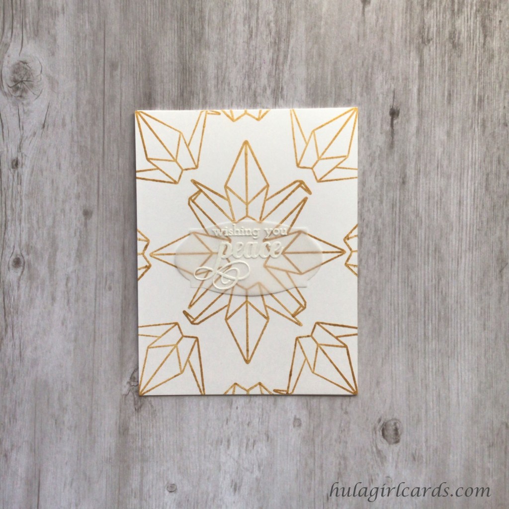
While I usually challenge myself to create with a different stamp set for each class, this time, however, the cranes from Altenew’s Ori Kami stamp set seemed the perfect choice for a card, inspired by the AECP course In the Mood for Color, where emotions are highlighted through intentional color choices.
The simplicity of this white and gold card exudes peacefulness, tranquility, comfort, and the hope of healing. To create the background, perpendicular quarter grid lines and diagonal eighth lines were marked on a spare card front. This template, when paired with a protective lamination sheet, was used to audition center radiating crane placement prior to stamping them in Altenew’s Enchanted Gold Pigment Ink on the card front by aligning the wing’s center line with the marked grid, vertically and horizontally for the center grouping and diagonally for the corner birds.
To finish this card, the 3″ x 1.5″ oval from Altenew’s Apothecary die set was used to create a vellum focal point for the sentiment “wishing you peace” from Altenew’s Warm Blessings stamp set while still enabling the whole of the swirling cranes beneath it to remain visible. This encouraging sentiment, embossed with WOW!’s Opaque Bright White embossing powder, served as an ideal place behind which to apply glue that would remain invisible from the front.
The pairing of a center-radiating-outward card design and the choice of a crane as a repeating focal image calls to mind mobiles made of a thousand cranes, which further reiterates the wish for peace both from the sentiment and the color choices.
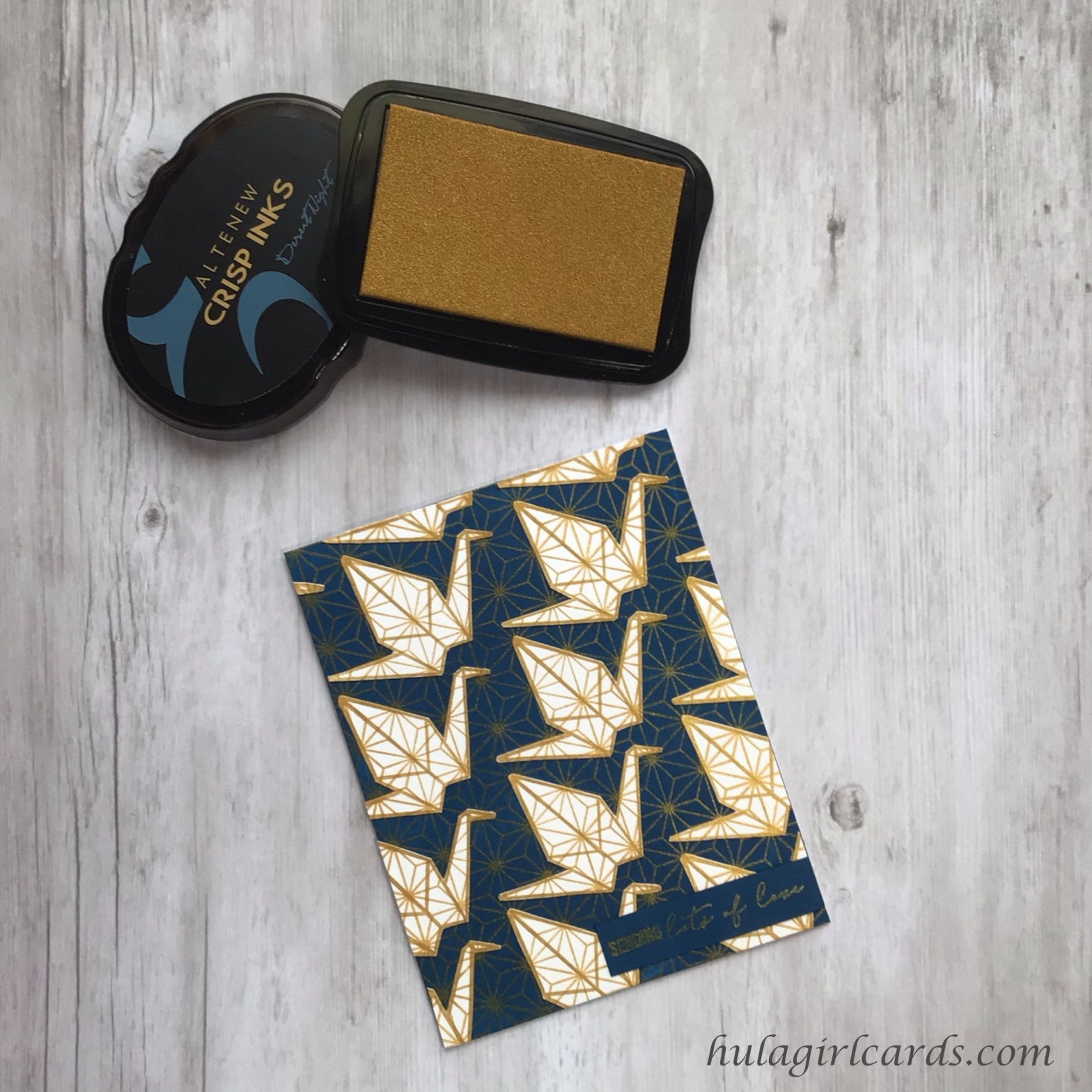
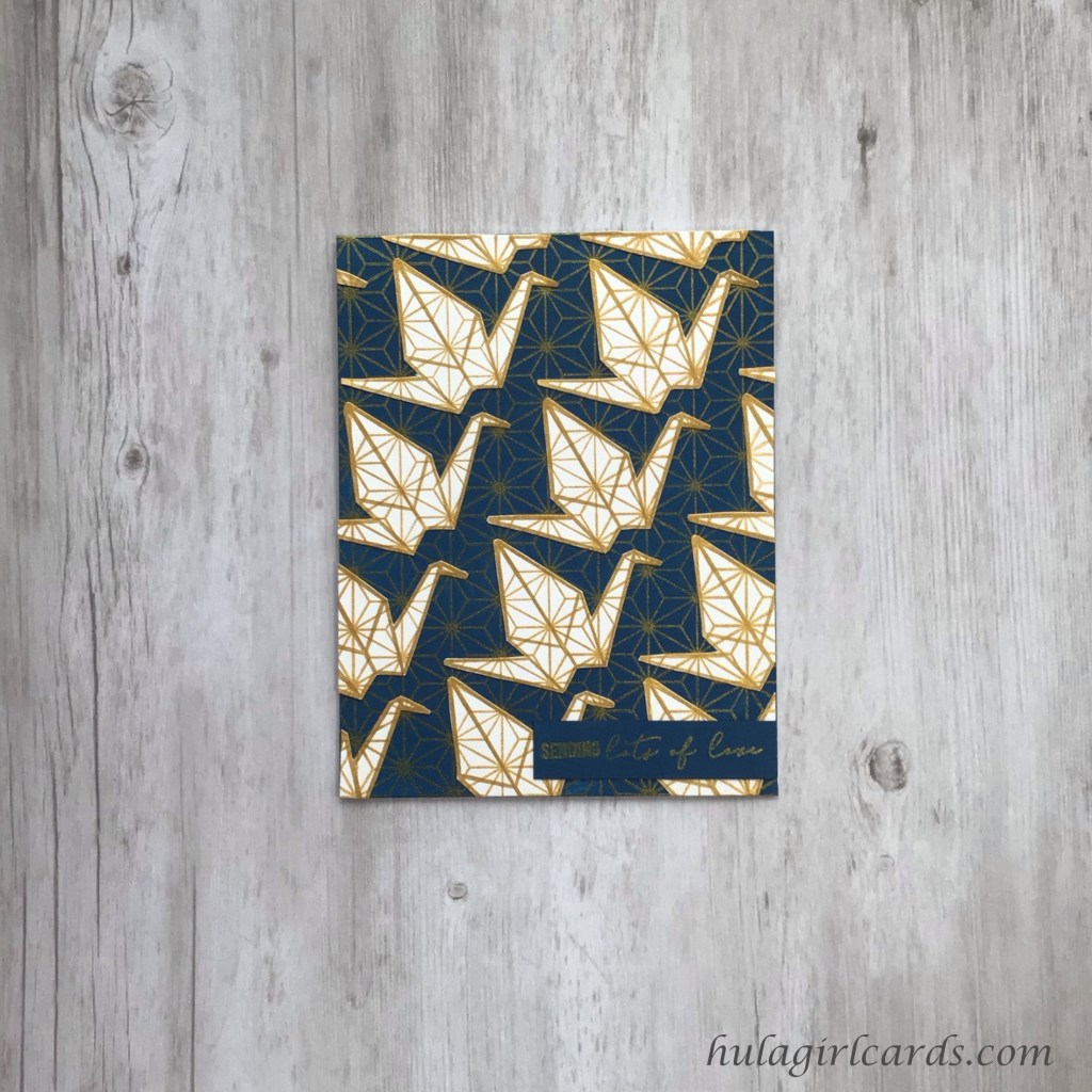
A flock of white cranes flies through the night to send encouragement in this card, inspired by the AECP course Beyond Basic Backgrounds.
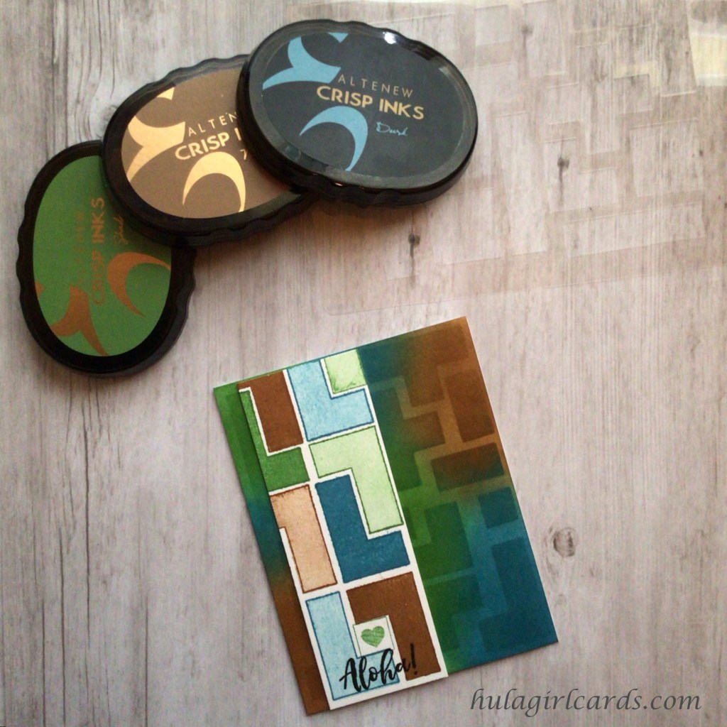
To create the look of specialty origami papers printed with an eight-point star design reminiscent of sashiko, Altenew’s Faceted Stars background stamp was impressed with shimmery Enchanted Gold Pigment Ink on two sheets of A4 cardstock, one of which was coated direct to paper with Desert Night Crisp Dye Ink and blended for a smooth finish. In order to obtain identical stamping on the white and blue sheets, a stamp positioner was used. After placing the stamp on the hinged lid, the blue cardstock was centered on the stamp and temporarily taped into place on the magnetic bed of the positioner. Then, the white sheet was taped on top of the blue paper. With the papers thus secured, the stars could be stamped multiple times until the stamped image became strikingly vibrant.
Once dry, the white sheet with gold stars was returned to the stamp positioner, preparatory to stamping the cranes. To yield the maximum number of cranes, the bird from Altenew’s Ori Kami stamp set was positioned in the upper left corner with the hub of the star meeting the tip of the wing. The stamp was rotated in a diagonal orientation until a subsequent hub passed through the center line of the wing. All cranes were stamped several times in this orientation to thicken the contour line for fussy cutting and were situated closely together. By using reference points between cranes, it was possible to stamp off the edge while maintaining proper crane placement and orientation, which helped build the look of a gigantic flock.
To marry the light and dark colorways, the cranes were fussy cut by hand and glued in their corresponding place on the blue cardstock, the star-studded stamping of which became invaluable when aligning the cranes correctly. Because of the meticulous care taken to stamp the fowls consistently on the white background, their avian formation blends seamlessly into the starry night.
To finish this card, a strip of cardstock was saturated with Desert Night with the same direct-to-paper technique as the background and stamped with the sentiment “sending lots of love” from Altenew’s Sewn With Love stamp set. With the Enchanted Gold sentiment positioned low on the card, the droves of cranes leap into focus against the expanse of the night sky.
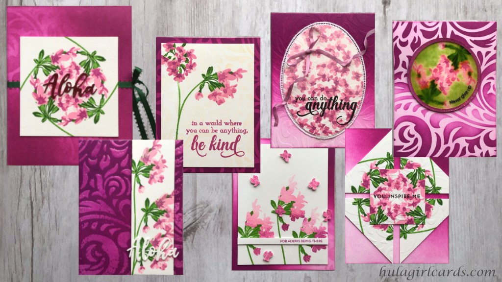
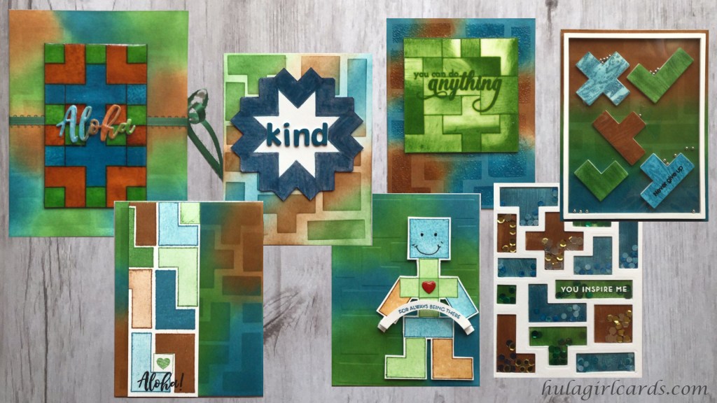
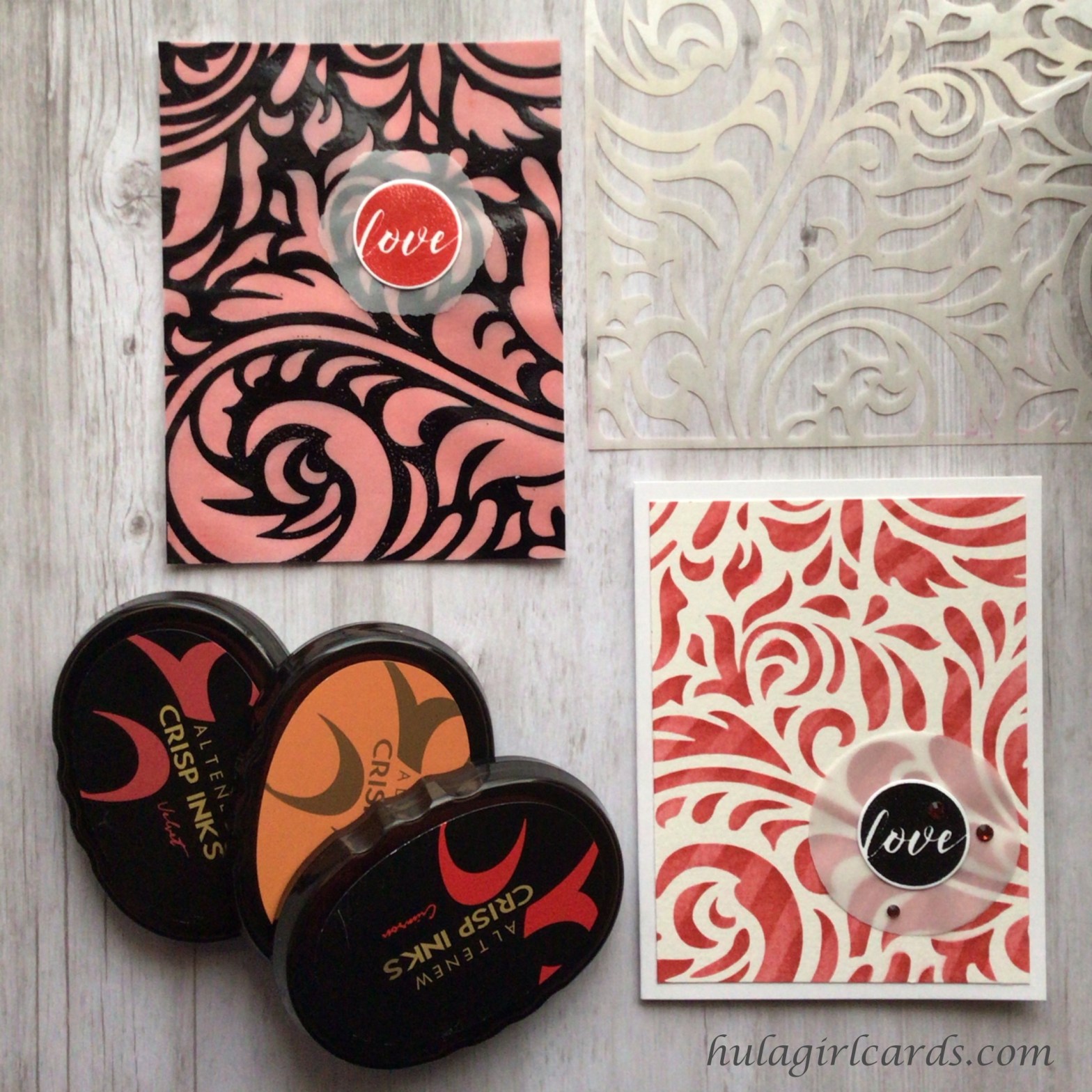
Ink layering, ink blending, stenciling, and thematic sentiments are the unifying elements in these card sets inspired by the AECP courses All About Layering 1 & 2, Easy Ink Blending Techniques, and Celebration: Stencil Techniques.
In the quilting world, the moment when a quilter is finally ready to quilt the top over which she has labored and promptly forgets every design she knows is humorously referred to as quilter’s amnesia. A stamper’s amnesia variant happened to me as I began this project. To find inspiration and overcome this momentary lapse in memory and creativity, I returned to cards I had previously made, especially those for the AECP program. In studying them, it became obvious that I enjoy inked cards and intricate patterns, which narrowed my course selection to three ink-intensive classes for techniques to showcase. Each card in these sets, both masculine and feminine, features an ink-blended base, layered stamping on an accent piece, and various stencil applications.
These masculine and feminine card sets contain sentiments that embody the spirit of aloha through encouragement and thankfulness. For Hawaiians and those who perpetuate the Hawaiian culture, aloha exists as a chanted acrostic, meaning far more than merely hello, goodbye, and love. Each letter stands for various attributes to which all should aspire:
The chosen sentiments emphasize kindness, being present for one another, confidence, encouragement, and perseverance and are featured on both the masculine and feminine card sets.
The use of recycled elements often finds its way into my work and has certainly found its way into this project. If the printer malfunctions or I print a material with mistakes, I quarter the paper and use it for notes rather than immediately relegating it to the recycling bin. All my planning for this project was written on such salvaged paper.
Any laminated materials with errors find a second home with my ink blending supplies with various applications. Laminated paper has enough body to stand up to the rigors of ink blending. It is especially handy when the back portion of a card base needs to remain clean. Paper can be taped to the surface, and card bases can straddle the lamination and be secured at the back, the tape of which can be reused numerous times by smoothing it on the dedicated sheet of such lamination after removing the card base.
The empty portion of partially-filled lamination pouches has many uses, too. With them, I audition stamp placement and even test stamp layers, which protects the cardstock from stray ink marks and saves many a project from stamping errors. A small square of blue tape serves as an added security measure when placed on the lamination’s corner because it provides tactile feedback to ensure that the same side is facing upwards each time I used it. With this method, the cardstock beneath is always protected because its front never touches the side on which the empty lamination has been inked. Such laminated plastic can be used for acetate windows on shaker and other interactive cards. The masculine set features a few examples of this last application.
For added dimension, each accent panel in these sets has been adhered with multiple supporting layers of reused cardstock, paper with stamping mistakes or practice pages. The book-style packaging for these sets uses two optional reinforcement strips for the bottom and exposed side, which were cut from second-use paper. Using three to five intervening layers also serves to strengthen the accent piece, preparatory to applying large swaths of Glossy Accents, a technique of which I’m particularly fond.
Navigation Gallery
Wahine Aloha Card Set
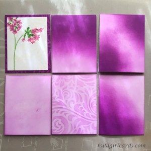
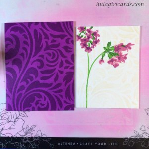
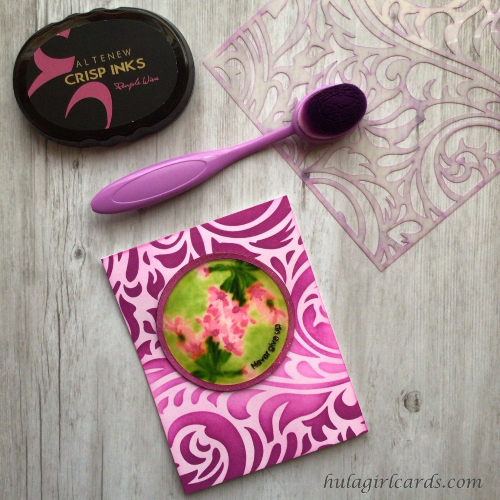
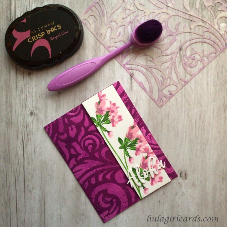
In the Wahine, the Hawaiian word for women, six-card set, clusters of pink flowers from Altenew’s Delicate Clusters stamp set are enhanced by backgrounds that gradate from soft shades of pink to more intense, darker tones. Amazingly, that ombre effect was produced by blending a single ink color, Altenew’s Purple Wine Crisp Dye Ink.
Supplies
Altenew Delicate Clusters Stamp Set
Altenew Elegant Swirls Stencil
Altenew Sentiment Stamp & Die Sets
Be Kind
Build-a-Flower: Fuchsia
Fancy Greetings
Painted Butterflies
A Walk in the Woods
Totally Tropical
Gina K. Designs 3.75″ Wreath Builder Template
Inks
Altenew Green Valley Crisp Dye Ink Collection
Grass Field
Shadow Creek
Mountain Pine
Altenew Rose Petal Crisp Dye Ink Collection
Rose Quartz
Puffy Heart
Purple Wine
Cosmic Berry
Altenew Vanilla Cream Crisp Dye Ink
Altenew Obsidian Pigment Ink
Hero Arts Unicorn White Pigment Ink
VersaMark Watermark Stamp Pad
Alcohol Markers
Altenew Artist Marker
Rose Quartz
Cosmic Berry
Copic Colorless Blender
Blending Brushes
Pink & Main Ergonomic Blending Brush
I-Crafter’s I-Brush Ink Blender Brushes
Craft Ink Blending Brushes
Tonic Tim Holtz Stamp Platform
Fun Stampers Journey 6″ Die Cutting & Embossing Machine
Altenew’s silicone Crafters Essential Stamping Mat
Acrylic blocks
Paper Tools
Neenah Classic Crest Solar White 110-lb. 297-gsm cardstock
Neenah Classic Crest Solar White A2 80-lb. 118-gsm envelopes
Full Adhesive Post-It Notes
Tombow Mono Sand Eraser
Teflon bone folder
Scor-Pal 12″ scoring board
Cutting Tools
Tonic Studios – Tim Holtz – 8.5 Inch Comfort Trimmer
3″ Nesting Circle Dies or Cricut Paper Cutting Machine
Embossing
Wagoner Redesigned HT400 Heat Gun
VersaMark Watermark Stamp Pad
WOW! Embossing Powders
Clear Sparkle
Clear Gloss Ultra High
Inkadinkado Embossing Powder Tool
Adhesives & Tapes
Blue Painter’s Tape
Crafter’s Essentials Easy See Tape
Art Glitter Glue
Scor-Tape 1/8″
Scrapbook Adhesives Thin Foam Squares
Stampin’ Up! Mini Stampin’ Dimensionals
Shine
Tonic Aqua Shimmer Pen
Ranger’s Glossy Accents
Sewing Supplies
Swiss Baby Entredeux
YLI 4mm Japanese Silk Ribbon, color 022
3/16″ Forest Green Picot-Edge Ribbon
Gingher 5″ Knife Edge Sewing Scissors
Stamp Cleaning
Aidea Microfiber Cleaning Cloths
Lawn Fawn Stamp Shammy
Ultra Clean
Distilled water spray bottle
Reverse-action tweezers
Backgrounds
To create the basic backgrounds for this six-card set, the top-folding card bases were individually straddled across a laminated pouch of cardstock and secured on the back with painter’s tape. Then, the interior front of the card was temporarily adhered to the laminated cardstock with Easy See Tape. Securing the card base thus provided greater area to weight the card base with a hand without becoming inky and ensured that the card’s back would remain clean by remaining immobile during the rigors of ink blending on top of a silicone mat.
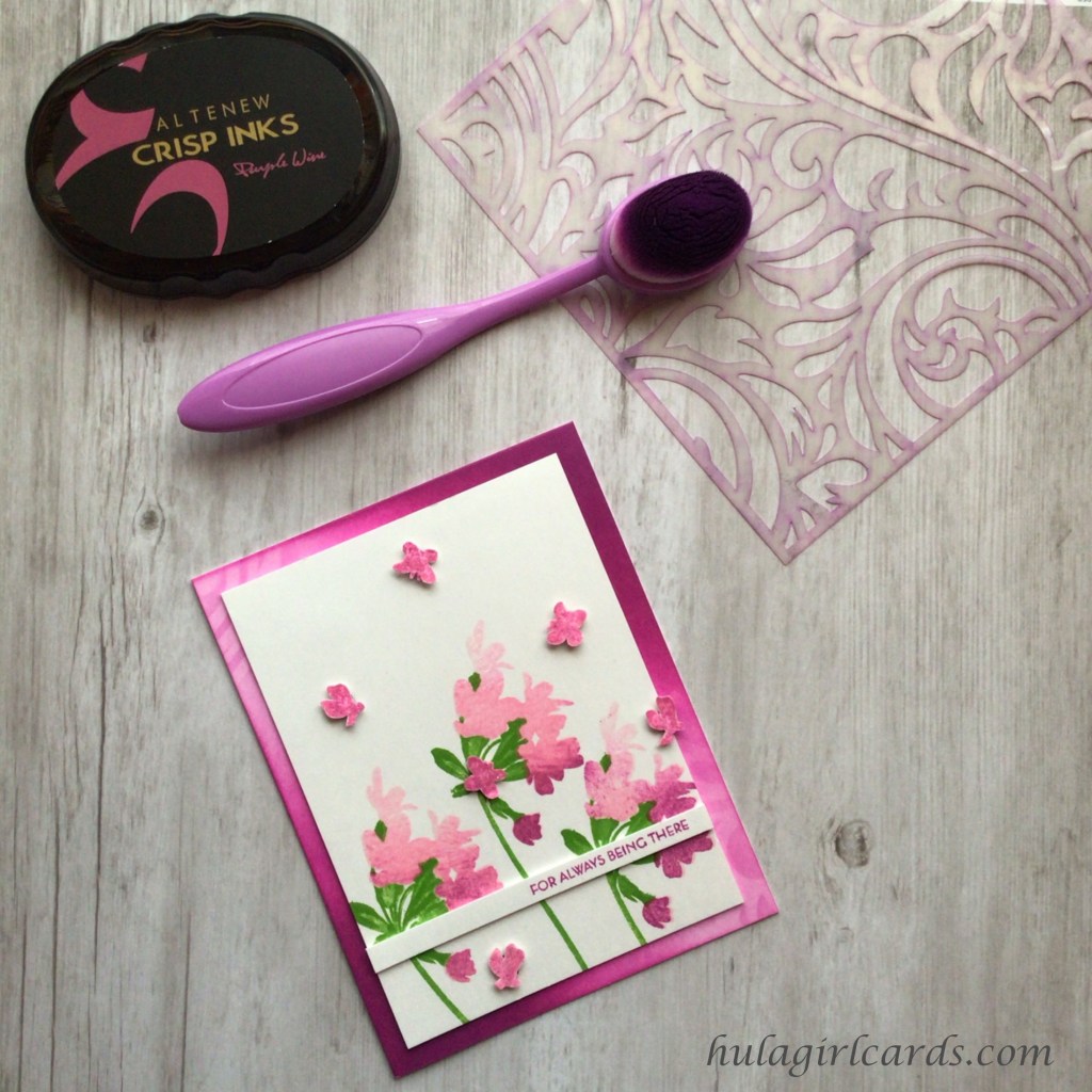
Using the Pink & Main Ergonomic Blending Brush, Purple Wine was applied to the blended surface of the card bases with several variations. Two were light, one medium, and the remaining three with different ombre colorations. These bases were set aside until individual accent pieces were created for each of them, after which both card base and accent piece were transformed into a cohesive whole.
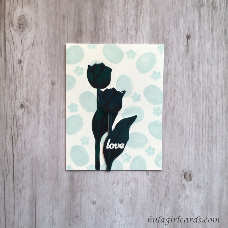
The kindness card features a lush, beflowered stalk against a subtle tone-on-tone background of Elegant Swirls stenciled in Vanilla Cream. To achieve this look, an A2-sized sheet of cardstock was adhered to the back of stencil, and Vanilla Cream was lightly blended with a Craft Ink Blending Brush. As the flowers were to be stamped on top of this stenciling, care was taken to ensure that the golden shade remained suitably light by peeking under the stencil to check Vanilla Cream’s concentration against the white cardstock rather than relying solely on the ink-smeared surface of the stencil and its openings for contrast.
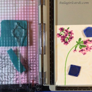
In order to use both flower clusters on one stalk, it was necessary to stamp them in multiple passes. First, stalk A1 was shaped on top of the protective lamination, the sheet with the blue square mentioned in the tutorial’s recycled elements portion, so that a curve was formed as if the clusters were weighing the stem’s offshoot. Then, B1’s stalk was positioned so that the flowers would be stamped directly in line with the vertical portion of A1’s stem. B1 was partially stamped by omitting the stem portion and stamping only the sepal portions at tips of the stalk. These base and subsequent layers were stamped with in the three darkest shades of the Green Valley Ink Collection.
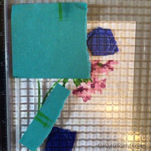
In all the stamped layers, including the flowers, this oversized protective sheet of lamination was used to audition stamp placement. The stamps temporarily adhered to the protective sheet and were easily transferred to the hinged plate of the stamp positioner. Then, the inked stamps were impressed on the surface of the protective sheet. If needed, the sheet could be cleaned, the stamps repositioned, and the layer test stamped once more. This was invaluable in ensuring that the stamped images were in their proper placement. To clean the protective sheet, care was taken to gently brush toward the center of the sheet with a microfiber cloth rather than pull the ink towards the edges of the lamination. By keeping the ink away from the edges, no stray ink ever found its way to the cardstock below.
After stamping the blossom clusters in pink shades from the Rose Petal Ink Collection, the protective sheet was again pressed into service to stamp the remaining stalk portion. The A1 stalk was positioned so that it met the bottom of the previously stamped stalk and extended into the B-series flower cluster. With the positioner closed and the stamp uninked, Post-It Notes were used to mark the portions of the stem in need of ink. Then, the stem was inked Grass Field. Any extraneous ink was removed with a microfiber cloth prior to impressing the partial image.
To draw the remaining portion of the stalk where the greenery meets the curve of the lowest blossom, an alcohol colorless blender was dabbed onto the Grass Field ink pad, and the resulting color was used to complete the stem. Then, the blender was marked on scratch paper until the color became clear once more.
The focal front was trimmed to 3.75″ x 5″ so the top cluster looks as if it extends beyond the boundary of the focal piece. In order to match the pattern between the card base and focal background, the stamped paper was centered on top of the medium-blended card base and temporarily taped in place. Then, the Elegant Swirls stencil was placed on top of the taped layers and adjusted until it precisely matched the Vanilla Cream stenciling on the focal piece. The stencil was then temporarily adhered to the card base, the accent piece and its tape removed, and the base secured to the back of the stencil. With a Craft Ink blending brush, additional Purple Wine was brushed into the open channels of the stencil until a vivid coloration was obtained.
Dimension was added to the focal piece by adhering two layers of second-use cardstock, paper that would otherwise be deemed fit only for the garbage. The two used in this example were from the testing portion of designing this card, and the purple layer even features light embossing, which did not disturb the flat surface of the focal panel. This dimensional piece was adhered to the card base with significant care taken to ensure the stenciled patterns matched. The effect is subtle, but well worth the effort for the seamless look created.
A note regarding liquid adhesives: In this tutorial, when gluing an accent piece to the card base, especially when matching a pattern, no glue was placed within 1/4″ to 1/2″ of the edges of the panel depending on size. This ensures that no stray glue marks will be visible if a focal panel requires more than minute adjustment.By weighting the glued unit, no edge curling was visible when the panel dried.
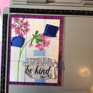
To position the sentiment, more salvaged lamination was used, a homemade one-third grid, which is particularly useful in ensuring elements conform to the rule of thirds. A note regarding homemade grids: Permanent ink, such as Sharpie Markers, transfers to clear stamps and thus onto stamped cardstock. To avoid this transfer, the A2 card front-sized grid was marked on spare lamination with permanent ink. This piece was saved until another partial lamination pouch in which it would fit was available. The tool was thus laminated twice to enclose the permanent markings so they would neither transfer to stamp nor paper.
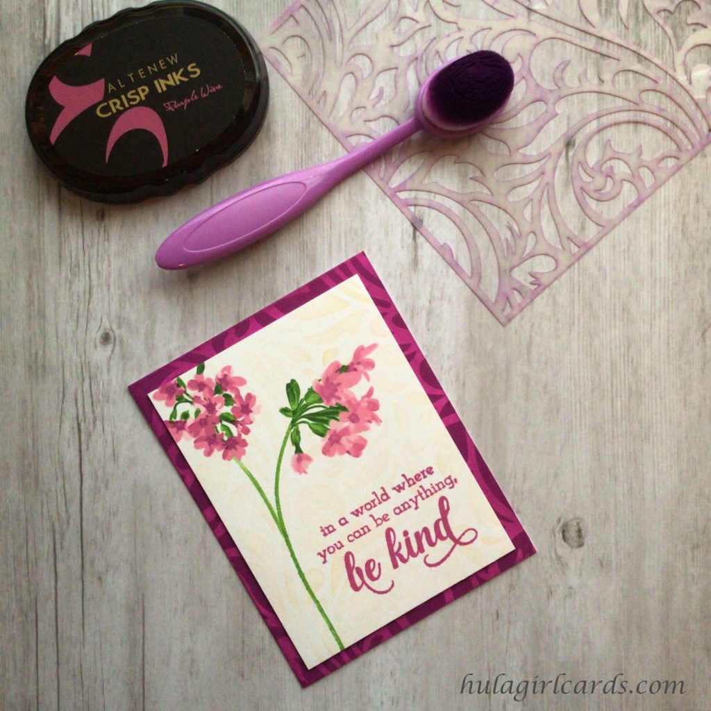
This sentiment from Altenew’s Be Kind stamp set proved challenging to position. To combat the issue, the printed carrier sheet was taped onto the grid, and the stamp positioned on top, much as the prior layered stamping was accomplished. Using the carrier sheet provided greater contrast in the positioning process than the uninked clear stamp provided.
The sentiment “in a world where you can be anything, be kind,” was stamped in Purple Wine under the listing blossom, as if kindness should be sprinkled like petals from a flower.
Sparkling butterflies flutter about a trio of ombre flowers on the unity card. To create this card, three A1 stems were stamped on an A2-sized sheet of cardstock, making certain to vary the heights for a pleasing look. All three stem layers were stamped in Grass Field ink for subtle shading of the stem, its sepals, and leaves.
For the blossoms, only the A4 base layer was used. The ombre look was achieved with multiple impressions of this layer. First, the stamp was impressed in its entirety with Rose Quartz ink. Then, Puffy Heart was applied to all but the top of the stamp and blotted along the upper border to soften the line of demarcation between colors. Purple Wine was used for the next pass and was blotted away from a greater portion of the stamp, and again for Cosmic Berry. For added variety, the shading on the leftmost flower only goes as deep as Purple Wine. The other two flowers contain the deeper tones of Cosmic Berry, but purposefully vary in placement. The middle, highest flower has touches of it only on the lowest blossoms, while the rightmost flower’s blossoms are nearly half-drenched with the color.
As one works with a layering stamp set, particularly a set used as frequently as it was for these cards, various attributes are discovered. Each time I stamped the B cluster, I called B5, the flower’s second layer, the butterfly layer because two blossoms in particular reminded me of a butterfly in flight and one coming to land respectively. It seemed appropriate to create those butterflies for this card.
The B5 layer was repeatedly stamped with Purple Wine ink along the edge of a spare piece of second-use cardstock. After heat setting the ink, VersaMark’s Watermark Stamp Pad was pressed along the surface of the paper, and WOW!’s Clear Sparkle Embossing Powder was applied to the surface. In this instance, no anti-static powder tool was needed. Once the embossed butterfly layer cooled, six of the resulting butterflies were fussy cut and their edges turned soft pink with Altenew’s Rose Quartz Artist Marker. The butterflies were adhered to mini foam hexagons. After trimming the focal panel to 3.75″ x 5″ and with care taken to ensure plenty of head room for the butterflies in flight, four butterflies were positioned in a cloud around the flowers, while the remaining two were placed very near and on a flower to suggest landing.
The diagonal ombre card base seemed to suit the accent panel. Rather than stencil the whole of Elegant Swirls on it, instead, only the light pink areas were gently stenciled, which coordinates nicely with the dichotomy of fluttering butterflies and the deeper tones of ombre blossoms.
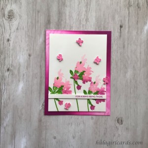
To stamp “for always being there” from Altenew’s Build-a-Flower: Fuchsia stamp set, the stamp was positioned parallel to the stamp positioner’s hinges and inside a quarter-inch mark along the ruler’s lower edge. Perpendicular-to-the-bottom-ruler positioning yields a better impressed result for narrow sentiments. After stamping the sentiment on a card-front sized sheet of cardstock, the paper was trimmed with a guillotine-style paper cutter 1/4″ from the edge. Two additional strips were cut from second-use paper at a scant quarter inch, and all three strips were trimmed to 3.75″ in width prior to being adhered across the lower flowers where the stems meet the blossoms. To finish the card, the dimensional focal panel was adhered to the top-folding card base.
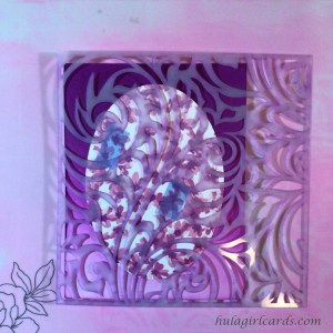
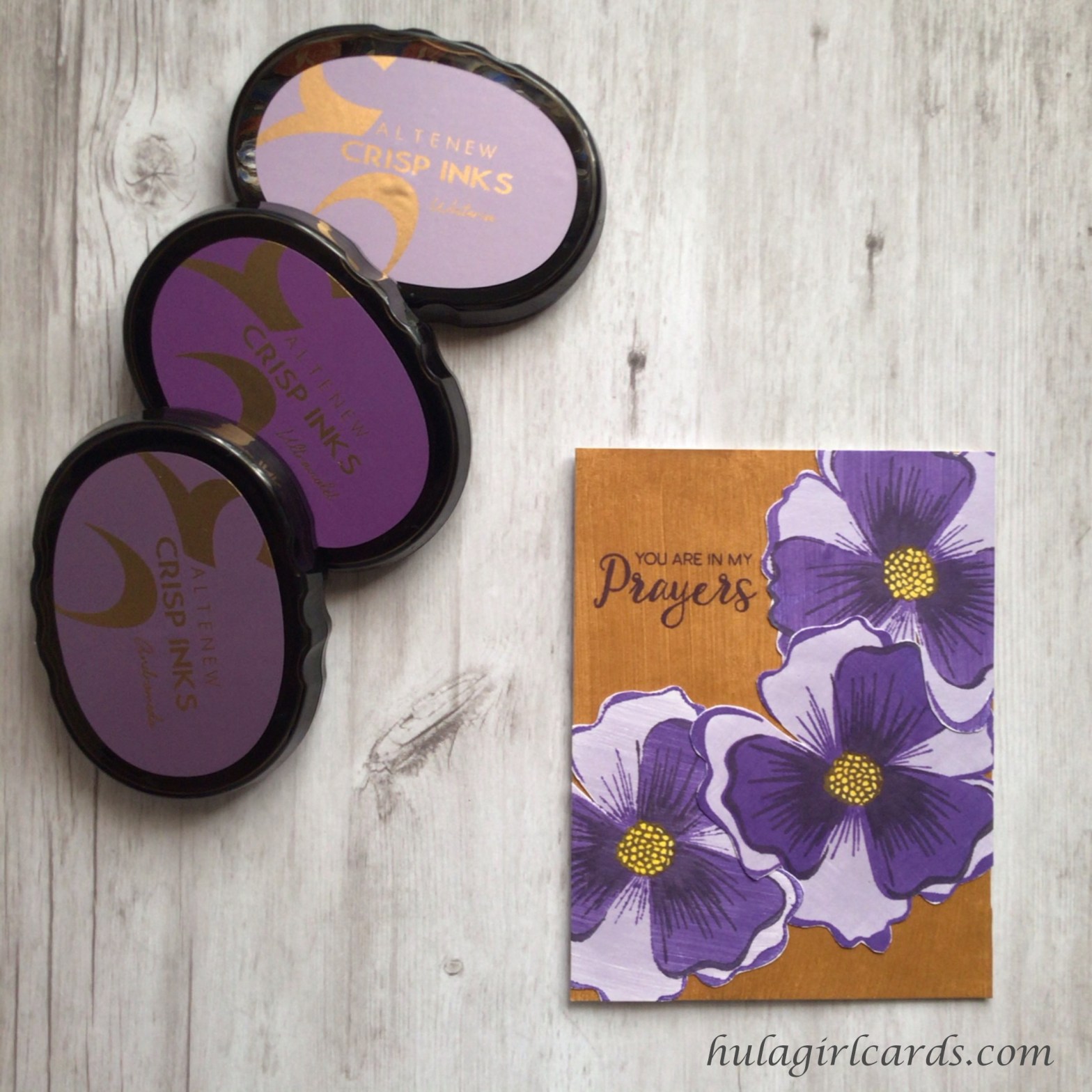
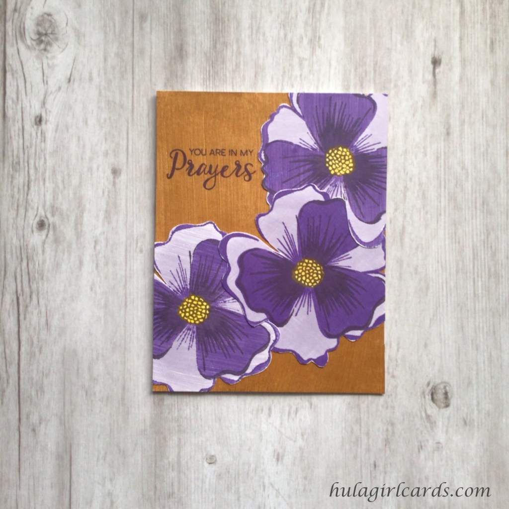
Heirloom sewing accents of a delicate silk ribbon bow and entredeux border are charming details found on this unabashedly pink positivity card, which was inspired by another heirloom technique, Madeira Appliqué. In the sewing industry, Madeira Appliqué windows frame accent shapes, which often feature embroidery. The two fabrics are adhered to one another along the interior frame of the window with stitching. In this card, a white border of baby entredeux simulates the stitching.
The focal oval was created with a Cricut cutting machine, but could easily be created with nesting oval dies. The oval frame measures 3.75″ x 5″, and the nesting oval measures 3.25″ x 4.5″. These were cut three times, once with clean cardstock and twice with second-use cardstock. The frames were set aside for another card in the masculine card set.
The ovals were reassembled and temporarily adhered on the back. A buffer strip of cardstock was used to raise the resulting unit in the stamp positioner so flowers from the B-cluster could be stamped on the lower portion of the oval. The protective sheet was used to hold the blossom layers in place and protect the cardstock from residual ink on stamps that were merely brushed with a dry microfiber cloth between impressions. The clusters were stamped in shades from Altenew’s Rose Petal Ink Collection with a heavier concentration toward the oval’s bottom and with a increased space near the top.
With so many identical base layer clusters double stamped with Rose Quartz, some method was needed to differentiate one cluster from another. The base blossom layer B4 proved invaluable. Finding individual clusters with the base layer had the added benefit of helping to orient the subsequent B5 layer, which could be checked by placing it on top of layer B4. Then, after removing the base layer, the second layer could be positioned on the protective sheet and picked up by the stamp positioner. No matter how the orientation of the clusters changed across the panel, the base layer helped make sense of floral largess.
Despite desiring an ombre look, each flower’s layers were double stamped. At the very least, the lower portions of the oval needed to be vibrant. To mute the upper portions of the oval with a gradated effect, Hero Arts Unicorn White pigment ink was pounced onto the surface of the oval with an I-Crafters Blending Brush. The ink was smeared onto the surface of Altenew’s silicone stamping mat in order to protect the pad from color transfer. The ink was applied with a heavier concentration at the top which helped to soften the intensity of the stamped blossoms. This concentration was gradually reduced across the oval until the bottom flowers were merely kissed with the white pigment. By pouncing the ink across the entire oval, the white spaces between the blossoms matched, looking like one sheet of cardstock.
The top-folding card base chosen for the positivity card features ombre inversely colored with respect to the focal panel. The darker portion is near the fold and lightens toward the bottom edge. To avoid detracting from the busy focal oval, the Elegant Swirls stencil was dry embossed on the card base. Then, the oval was centered and temporarily taped to the base.
As with the kindness card, the stencil’s pattern was matched to the card base prior to taping the accent oval to the back of the stencil and removing the tape from the front. This time, however, the oval was embossed rather than inked for an even more subtle result. The accent oval was adhered to the two remaining, second-use ovals. After applying adhesive to the oval unit, the embossed patterns were carefully matched and glued to one another.
At this point, the card was ready for a sentiment and would have been beautiful, but a few delicate touches sprang to mind. Enter heirloom sewing. Entredeux means between the two, and Swiss baby entredeux looks like a “railroad track for ants,” as heirloom sewing expert Martha Pullen is fond of saying. It is normally sewn between some combination of lace and fabric. The purchased embellishment has fabric on either side, both of which must be carefully and meticulously trimmed away with good fabric shears so the entredeux will be free to be shaped around curves. For this task, Gingher scissors are immensely suited.
To adhere the entredeux along the oval’s perimeter, Glitter Glue, a strong, liquid adhesive, was applied to the card base along the oval in short passes. With the aid of the closed tip of reverse action tweezers, the entredeux was held in place until the glue set, which took only a few second to accomplish. The gluing process was repeated until the starting point was overlapped by approximately half an inch.
A sweet silk ribbon bow rests near the oval’s top with its long tails stretching to either end of the card like wings. After cutting twelve inches of the 4mm ribbon, the midpoint was found by aligning the cut ends. Then, rabbit ears were brought up as loops on either side of the midpoint and tied into a bow. Using this method ensures that both bow loops can be adjusted as desired without diminishing the knot’s integrity. The bow’s placement was auditioned on the card front, and 1/8″ Scor-Tape was applied to the spot. Silk ribbon is delicate, so care and precision were needed when securing the bow to the taped front.
Additional dimension and texture were created by twisting the bow’s tails outwardly. These tails were adhered to the card front with tiny slivers of Scor-Tape along the underside of the ribbon. Starting at the knot and working with one tail at a time, the tail was twisted and tacked into place with a tape sliver before proceeding down the tail. In this process of twisting and shaping the ribbon, these slivers enable the ribbon to hold the shaped imposed upon it. The resulting look is as flawlessly invisible as needle and thread work. Any extra fullness in the bow can be secured in the same manner, but some jauntiness and body in the ribbon is desirable.
Given the complexity of this heirloom card, the sentiment needed to be one that instilled confidence. “You can do anything” from Altenew’s Fancy Greetings stamp set was chosen, as if to encourage the readers of this tutorial that they, too, can create such intricacies on a card, as well as the card’s recipient that she may know true self-confidence. This sentiment was very, very carefully stamped in Altenew’s Obsidian Pigment Ink. The card’s dimensionality and textured surface were challenges to be overcome in stamping the sentiment. The greater depth of the stamp platform’s rubber setting was needed to ensure uniform pressure, and repeated, targeted impressions were needed to fill the lowest elevations of the focal oval. Ink was applied to the stamp and brushed away from successfully impressed letters so only the areas that still needed to be stamped were filled with ink. With gentle force, these areas were pressed against the cardstock until the whole of the sentiment was stamped.
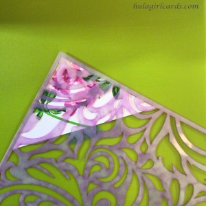
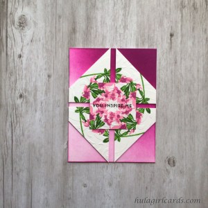
The humble card features a double-layer accent piece, each layer comprised of four identical quarter-square triangles – identical in stamping and embossing. While this card appears intricate, it was simple to create. The key to its realization lies in consistency.
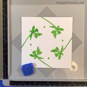
Using Gina K. Designs’ 3.75″ Wreath Builder Template made the task of creating the focal A-series cluster and stem easier. The A1 stem shape was positioned at a slight curve so that it extended beyond the square boundary. The resulting shape, stamped four times in the square orientation of the template, suggests a circle. The stem’s layers were stamped in the three darkest shades of the Green Valley Ink Collection.
Then, the base flower layer was positioned. When auditioning this layer’s placement, it became apparent that the lowest blossom would overlap the tip of the next. A brief test on scrap cardstock soon made it evident that this particular overlapping feature would prove disharmonious. To negate such muddying of the blossom, the lowest blossom in all four layers was wiped with a dry, microfiber cloth after applying ink to the stamp. Wiping the stamp proved effective in keeping that portion of the wreath free for the topmost blossom even in the darker shades of the Rose Petal Ink Collection. Though the flowers overlapped minutely at the center of the wreath, the shapes created failed to detract from the beauty of the piece, unlike the other instance of overlapping. Three identical wreaths were stamped and lightly heat set, two of which were used for this card. The final wreath will be featured on the packaging later in this tutorial.
Using a guillotine-style trimmer, two of the 3.75″ squares were cut in half diagonally, producing two half-square triangles. The square was reassembled and temporarily adhered, making certain not to place any tape in the square’s center. The taped square was sliced diagonally once more perpendicular to the previous cut, which yielded four half-square triangles. The third square was kept as one uncut piece and set aside for later use.
Identically stamped images seemed to invite identical embossing. To ensure uniform embossing, a corner of the Elegant Swirls stencil was chosen for its visual interest, and one triangle was adhered to its back along the right triangle’s hypotenuse, its diagonal edge. This taped unit was embossed with a die cutting machine on its embossing settings. Had a different portion of the stencil been desired, the borders of that area could have been marked with low-tack tape.
By consistently placing the tape along the hypotenuse, a rhythm began to develop for the subsequent steps, which helped to ensure each triangle was quickly and easily embossed with the same pattern. The tape served as a hinge so that the triangle could be flipped back to reveal the beautiful stamping and embossing.
Then, a new triangle was placed on top of the embossed one in the same orientation. The exposed stamping helped to verify that the positioning was identical.
The new triangle was flipped along the hypotenuse so that its stamped face was touching the stencil. The two triangles formed a square. After removing the embossed triangle, the tape was reused by placing it along the new triangle’s hypotenuse. Finally, the new triangle was embossed. Repeating this process six more times yielded eight congruent quarter-square triangles, identical in size, stamping, and embossing. The subtlety of this detail adds much interest to the card, and the consistency required to accomplish it is exceedingly rewarding when viewing the finished result.
Four triangles were backed with two layers of second-use quarter-square triangles made from two 3.5″ squares. The card base with diagonal, ombre blending was chosen for the humble card. Because of the intricacy of the congruent units and their embossing, no embossing was added to the card base. After finding the center of the card base, the triangles were reassembled as a square in the on point orientation, resting on the tip of a corner rather than a side. The triangles were positioned 1/8″ away from the center so that a 1/4″ gap resulted where two triangles meet, ultimately producing a cross.
The remaining triangles were reassembled into a square, using tape on the back of the cardstock to keep the shape together. Blue Easy See Tape was used, and while it is a temporary tape, the subsequent adhesives used will hold the shape as intended. On each side of the square, 0.75″ were trimmed away so that the square reduced in size to 2.25″. Mini adhesive foam hexagons were placed in the open channels on the card base, starting in the center and extending out 1″, which translates to creatinga 2″ cross with the foam hexagons to provide support for the 2.25″ square. This small square was glued in a square orientation on top of the disjointed, on point square, the latter of which was trimmed along the edges of the card base.
Though humbleness is often uttered in the context of vanquishing pride, it can be as simple and meaningful as paying a compliment to someone with a spirit of sincerity rather than letting one’s ego silence the overture. The compliment “you inspire me” from Altenew’s Painted Butteflies stamp set was stamped in Altenew’s Obsidian Pigment Ink in the center of the square. It is buffered on either side by the open channels bordering the disconnected square. The foundational application of foam adhesive helped support the 2.25″ square when stamping the sentiment. Because of the embossing on the triangles, some focused stamping was needed, as described in the positive card where ink was applied to the stamp and then wiped away from letters that had already been successfully impressed on the cardstock.
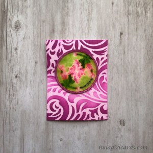
A dusky pink circle with wildflowers under glass were created with the aid of an alcohol marker and Glossy Accents for the perseverance card.
With the aid of a Cricut paper cutter, one 3″ circle was created as well as three 3″ circle rings measure 1/8″ thick, two of which were cut from second-use paper. These could have been created with a set of nesting circle dies. A note regarding foundational shapes: This technique utilizes large amounts of Glossy Accents. To avoid warping and distortion, use at least three base circle pieces. The frames were set aside for later user in this card.
After fitting the circle into its companion piece of cardstock and adhering the two temporarily on the back, the quarter points were marked on the companion piece, which helped ensure the A-series flowers were placed within one hemisphere. The A1 stem was positioned along the inside border of the circle, taking care to keep the bulk of the leaves 1/8″ from the edge as best as possible. Only the sepal and leaf portion of the stamp was impressed on to the paper. Then, the cardstock unit was rotated a half turn and the same portions of the A1 stamp were again impressed. The remaining A-series layers were stamped in deepening shades of green and pink.
To create the watercolor-like background, an alcohol colorless blender was repeatedly pressed on the Grass Field ink pad and dabbed on the circle in a splotchy fashion though care was taken to refrain from transferring green to the pink flowers. All white space was filled in this manner. The dabbing created a dappled effect rather than a smooth background because the amount of green faded as more is wiped off the marker and on to the paper. At this point, the flowers were a crisp contrast to the variegated dye-and-alcohol combination. This piece was set aside to dry.
Purple Wine was blended onto one of the circle frames for the top and embossed with clear sparkle embossing powder. All three rings were adhered and stacked together. Then, the Cosmic Berry Artist Marker was dragged along the interior and exterior perimeter of the frame for added shadow and dimension. The frame unit was glued atop the circle base and weighted until dry.
Once dry, the circle was temporarily adhered to scrap paper with a loop of tape under the circle portion and weighted in an effort to curb any future warping. Then, Glossy Accents was added, taking care to ensure even coverage. A note regarding Glossy Accents: This products reactivates dye inks, which suggests it contains some water in its formation. Using Glossy Accents over a large area where dye inks have been applied results in a watercolor-under-glass look, which is beautiful. If containing the ink is preferable, outline the dye inks with pigment ink. This technique variation is used in the packaging portion of the tutorial.
After the focal circle dried, it was glued to a lightly blended card base that features very dark Purple Wine stenciling. This time, the Elegant Swirls stencil was rotated so its focal plume rests laterally as if providing a shelf for the die-cut circle feature. Along the feather’s spine, a lighter blending was achieved with medium intensity. This variation in hue with dark colors anchored at the top and bottom of the card base creates a great sense of movement.
The “never give up” sentiment from Altenew’s A Walk in the Woods stamp set is meant to evoke the aloha principle that “patience brings victory.” When one has the tenacity necessary to continue striving toward one’s goals in the face of adversity, much can be accomplished. This sentiment was curved and stamped on the edge of the Glossy Accents-filled disc with Obsidian Pigment Ink, on top of which was added a dusting of WOW!’s Clear Sparkle Embossing Powder. The powder was very carefully melted with a heat tool by applying and removing the heat numerous times to avoid marring the hardened Glossy Accents and to preserve the crisp pigment impression.
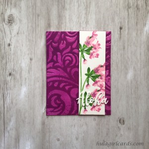
The aloha card’s column of flowers offsets texture-rich embossing. To create the focal panel, the A-series flower was stamped thrice in a vertical formation near the edge of a card front-sized sheet of cardstock, suggesting a long stalk. This illusion was further built by stamping off the edge of the cardstock and having the stem’s base nowhere in sight. The topmost stalk was stamped first. As with the kindness card, remaining stalks were positioned and masked with Post-It Notes to isolate those portions between the point where the branching stem connected with its sepals and the main stem.
The lower portions of the middle flower slightly overlap the bottom flower, which adds depth to the stamping and a sense of lushness to the scene. The flowers were stamped in green and pink shades from the Green Valley and Rose Petal Ink Collections. Then, the panel was trimmed 1.75″ x 5.5″ and adhered to three similarly sized second-use cardstock panels. The Coral Berry Artist Marker was dragged along the edges of the panel for added shadow. Sparkle was added to the flowers by brushing the blossoms with a Tonic Aqua Shimmer Pen.
Despite the dark pink of the background, the card base chosen was actually the lightest. In order to darken the resulting positive image of the stencil where normally the closed channels would require a lighter color, the stencil’s openings were ultimately sealed with embossing powder after receiving a medium blending of Purple Wine and being heat set. Preparatory to embossing, the card front was pounced with an anti-static powder tool. After cleaning and repositioning the stencil, Veramark’s clear ink was pressed into the opening. Then, a chunky embossing powder, WOW!’s Clear Gloss Ultra High, was applied, the excess of which was shaken from the paper. With such a large, crystalline embossing powder, failure to flick the back of the paper will result in flying embossing powder when the wind from the heat gun hits the paper, which while comical, is a no-good way to emboss a precise image. Once the base cooled, it was embossed twice more for a highly dimensional and more smooth effect. Despite multiple embossing passes, portions of the design continued to remain sparsely embossed, which adds character to the design.
After embossing, the cooled background was heavily blended until Purple Wine reached its darkest possible hue. Because the open portions of the stenciled design were protected by the melted embossing powder, the color applied within the stencil’s negative spaces remained true. Once the desired intensity was achieved, the background panel was wiped with a dry cloth to clean the residual ink from the embossed portions.
The accent panel was adhered 3/8″ from the right edge of the card base with a generous amount of strong, liquid glue because of the background’s dimension and texture. No glue was applied within 1/4″ of the edge of the panel to avoid visible dried glue should the shape need to be eased into position. The focal flowers were weighted with an acrylic block while drying.
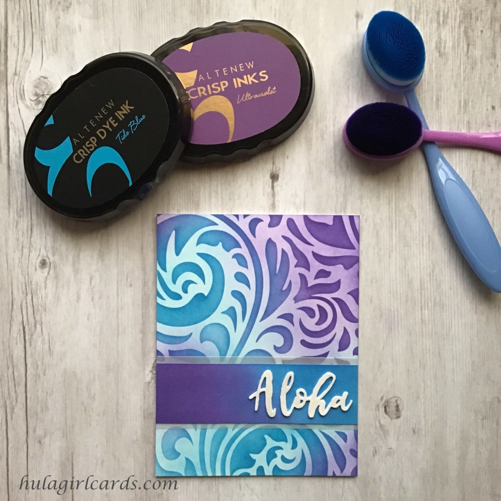
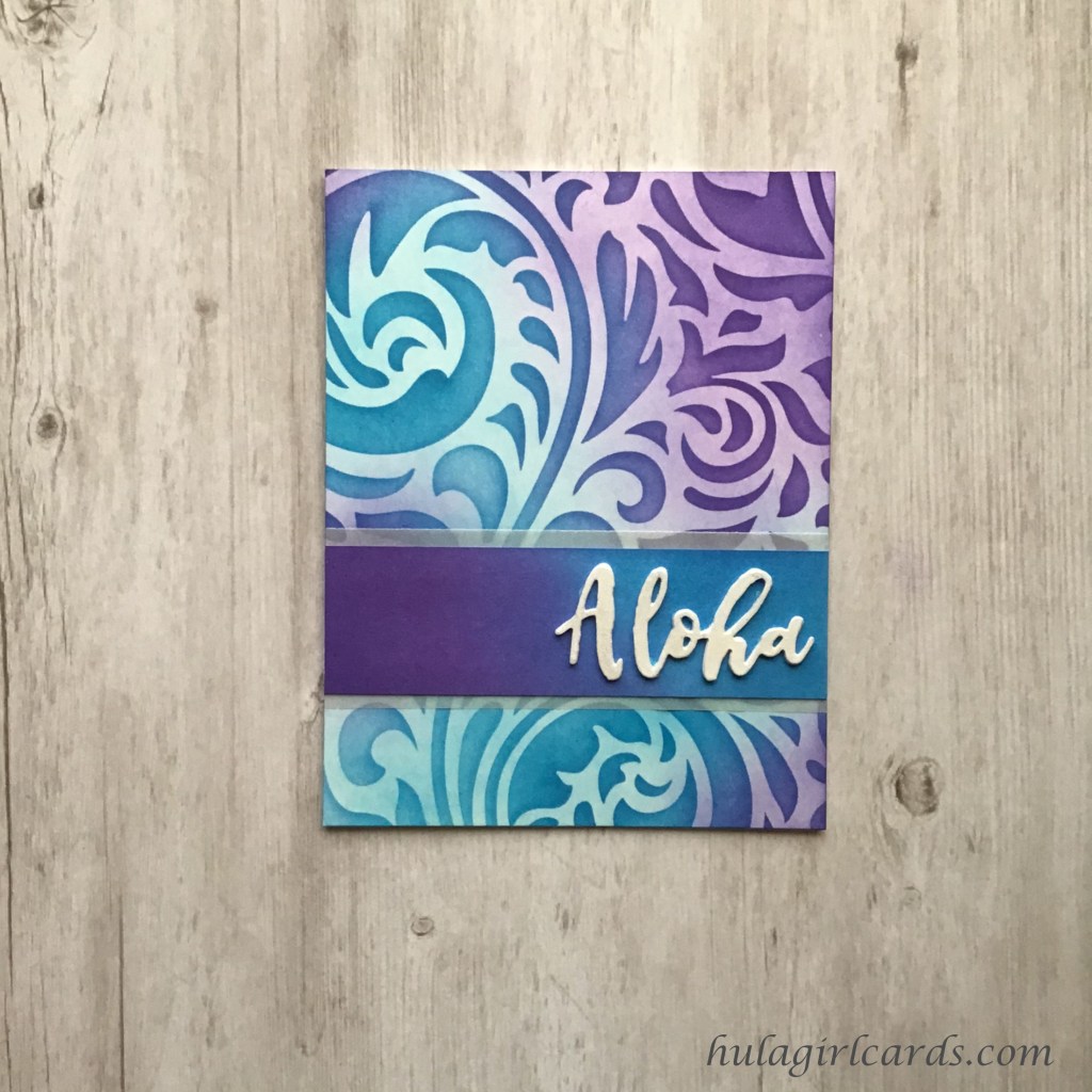
No aloha card set would be complete without at least one card bearing the sentiment “aloha,” and for this texture-filled card, only an die-cut aloha, adding even more texture and depth, would suffice. “Aloha” was cut nine times from scrap cardstock, making certain that at least three were cut from blemish-free portions. One set of three alohas were stacked and glued together. Two sets of alohas were glued in stacks of two, and the final two alohas were left loose for possible blending techniques. These unfinished sentiments were set aside for use on the packaging later in this tutorial. For this card, a white die-cut sentiment provided greater contrast with the cluster than any tint of pink or green. To that end, the sentiment was adhered across the lowest blossom and allowed to hang off the edge of the accent panel. By layering multiple aloha die-cuts, the sentiment has the strength to extend beyond the panel without any great risk of damage.
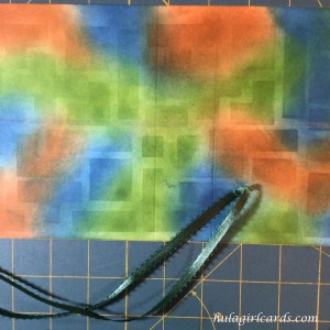
In the Kāne, the Hawaiian word for men, card set, block shapes meet a decided touch of playfulness. Altenew’s Building Blocks stamp and die bundle became the inspiration for this masculine, side-folding card set for both stamping and stenciling in shades of blue, green, and brown – Dusk, Shadow Creek, and Milk Chocolate respectively.
Supplies
Altenew Building Blocks Stamp & Die Bundle
Stencil Supplies
empty lamination pouch, laminated
1/8″ graph paper
pencil
Altenew Sentiment Stamp & Die Sets
Simple Alpha
Build-a-Flower: Fuchsia
Fancy Greetings
Painted Butterflies
A Walk in the Woods
Totally Tropical
Gina K. Designs 3.75″ Wreath Builder Template
Inks
Altenew Crisp Dye Ink
Dusk
Shadow Creek
Milk Chocolate
Altenew Obsidian Pigment Ink
VersaMark Watermark Stamp Pad
Markers & Pens
Jet Black Artist Marker
Pigma Micron Pen Black 05
Blending Brushes
I-Crafter’s I-Brush Ink Blender Brushes
Craft Ink Blending Brushes
ball chain lanyard
Tonic Tim Holtz Stamp Platform
Fun Stampers Journey 6″ Die Cutting & Embossing Machine
Altenew’s silicone Crafters Essential Stamping Mat
Acrylic blocks
Paper Tools
Neenah Classic Crest Solar White 110-lb. 297-gsm cardstock
Neenah Classic Crest Solar White A2 80-lb. 118-gsm envelopes
Full Adhesive Post-It Notes
Tombow Mono Sand Eraser
Teflon bone folder
Scor-Pal 12″ scoring board
acrylic ruler
Cutting Tools
Tonic Studios – Tim Holtz – 8.5 Inch Comfort Trimmer
A2 Nesting Rectangle Dies or Cricut Paper Cutting Machine
Kaisi Wire Cutter 5-inch
Embossing
Wagoner Redesigned HT400 Heat Gun
VersaMark Watermark Stamp Pad
WOW! Embossing Powders
Clear Gloss Ultra High
Opaque Bright White Regular
Inkadinkado Embossing Powder Tool
Adhesives & Tapes
Blue Painter’s Tape
Crafter’s Essentials Easy See Tape
Art Glitter Glue
Scor-Tape 1/8″ & 1/4″
Scrapbook Adhesives Thin Foam Squares
Shine
Tonic Aqua Shimmer Pen
Ranger’s Glossy Accents
Sakura Clear Glaze Pen
Stamp Cleaning
Aidea Microfiber Cleaning Cloths
Lawn Fawn Stamp Shammy
Ultra Clean
Distilled water spray bottle
Reverse-action tweezers
3/16″ Forest Green Picot-Edge Ribbon
Custom Stencil
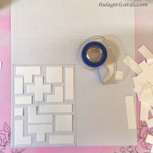
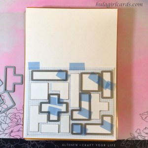
To create the stencil, three rounds of the Building Blocks die set were cut with a die-cutting machine. On the 1/8″ grid paper, an A2 card front-sized template was marked. Then, the pieces were positioned in a pleasing arrangement and taped into place with a temporary adhesive. The shapes do not conform precisely to the grid within restriction of the A2 card size, so some fudging of spacing was necessary.
Since the grid paper’s quality is light duty at best, a more sturdy template was needed. The grid paper was trimmed along the A2 lines and adhered to a sheet of cardstock. The dies were placed around their respective shapes in three passes. Care was taken to keep the shapes as straight as possible. This unit was passed thrice though the die-cutting machine to produce one stencil, which became the pattern for the subsequent stencils. Five cardstock stencils were created in all, three of which were used in this tutorial. One empty lamination pouch was also created utilizing the above technique, so the sheer stencil could be visibly aligned with a card front-sized sheet of cardstock with greater ease than the opaque stencil would have allowed.
Backgrounds
For the masculine card set, three deeply saturated shades of blue, green, and brown were chosen. Rather than ink individual card bases, the technique utilized in the feminine set, these backgrounds were created on A2 card front-sized papers and glued to the side-folding card bases in deference to reduced workspace that needed to accommodate multiple ink pads and brushes. Ink blending can be messy work, and with this option, maintaining a clean underside was not required.
Three backgrounds of medium intensity were created with all three colors blended in ameboid shapes. One background was created with lightly blended colors, and two backgrounds feature only two of the three colors in this set – one features blue and green while the second showcases blue and brown. These bicolored backgrounds will offset the third hue, which will be found on their companion focal treatments.
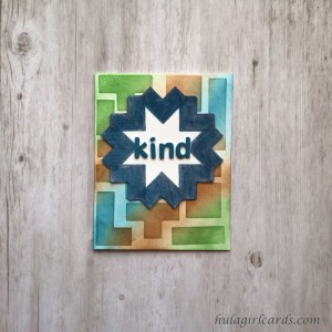
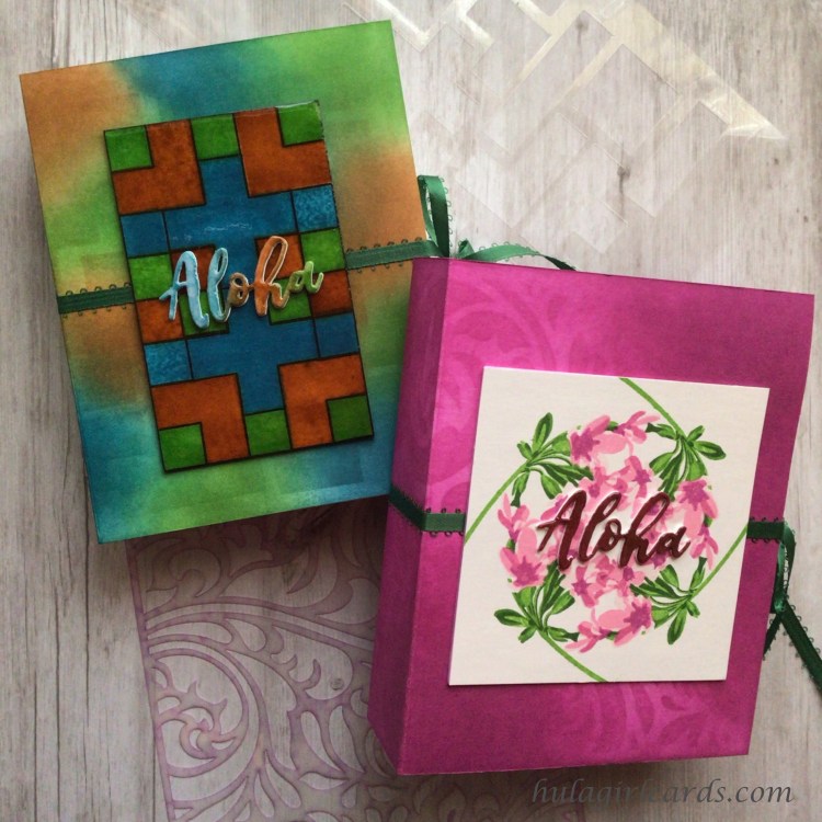
This kindness card features a striking chevron-inspired focal image with an interior 8-point star. To create this star, the squat L-shaped block was placed in a square orientation inside Gina K. Designs’ 3.75″ Wreath Builder Template and inked with two impressions of Dusk ink. The cardstock squares in prior uses of this template set were rotated only in the square orientation. This time, all eight positions were used, and each of the block’s outer edges overlapped. Because the same color was used throughout, the eye is not drawn to these portions; instead, the eight-point star becomes the focus.
After fussy cutting the star, the shape was turned wrong side up and traced onto two second-use cardstock scraps. These supporting layers were cut inside the marked line so that no white would be visible. The layers were glued to one another, and the inked portion of the star was brushed with a Tonic Aqua Shimmer Pen for a twinkling effect. Then, Glossy Accents was applied only to the colored, shimmery areas. The medium held its shape once squeezed, and no tool was needed to protect the white star.
Since the focal star spans the full width of the square used in the wreath template, a lighter background was needed to contrast the intensity of the focal stamping while still providing added interest. The sole light background was selected and adhered to the back of the stencil. Using the small blue, green, and brown I-Crafter’s blended brushes, each respective color was lightly brushed into the stencil’s openings. These small brush heads made it easier to fill the shapes with multiple colors as dictated by the background’s initial blending. After the Glossy Accents treatment set, the star was adhered to the card front, and the card front was adhered to a side-folding A2 card base.
The focal star’s starkly contrasting colors proved challenging when considering the sentiment. This card is the only one in the set with a different sentiment from its Wahine complement. Out of deference to both the size of the star’s Dusk portions and width of the kindness sentiment used in the earlier tutorial, the simplicity of the word “kind” was chosen as a fitting compromise for this card. The individual letters were cut four times from Altenew’s Simple Alpha die set, once from unblemished cardstock and three times from recycled, second-use cardstock. To the clean letters was applied a heavy blending of Dusk ink. To contrast with the star, these letters were left matte rather than adding any sheen or luster. Under these letters were adhered the second-used cardstock pieces, and the word’s placement was auditioned in the center of the star. The first and last letters overlap the tip of the chevron shape; however, because only the accent base is shiny, the letters remain legible. This bold sentiment, unsoftened by suffix “ness,” almost exhorts the recipient to be kind while also matching the graphic presence of the inked star.
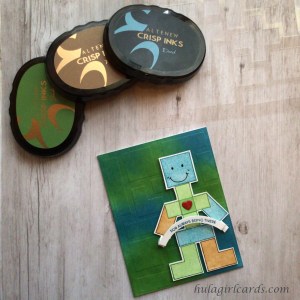
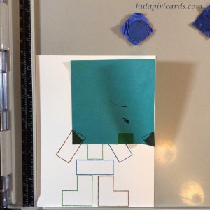
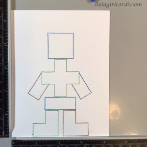
Whimsical features of a grateful block person, curved banner, and dimensional heart are adorable elements on this the unity card. Some ideas present themselves immediately when one sees a stamp set, and contained within this tutorial are several such first stamping inclinations. This block person is no exception.
During the planning phase to create the block being, the spare die-cut shapes, those produced by creating the stencils, proved useful in testing the concept. The pieces were assembled and measured to find which combinations were harmoniously suited to an A2-sized card. The squat chevron shape found in the previous card made more proportional sense for legs than the taller L-shaped pieces. Though straight arms holding the banner were chosen for this individual, using the squat shape presented another arm option.
For the stamping, both the outline and interior base layers were used. Because each shape and outline were stamped in corresponding colors rather than employing the same outline color throughout, it was important to realize that blue, green, and brown will become a muddy, murky brown if allowed to overlap. A minute amount of space was needed between each shape. Each outline was stamped twice for more visual presence and care was taken not to connect the same color adjacently.
Two areas required special attention for both layers of the stamp. This person was built from the feet to the head. Because a sizeable gap was included between the legs, none of the rectangular shapes included in the stamp set fit the needed width of the hips. For the outline stamping, first one half of the rectangle was stamped and the other half wiped away with a dry cloth. Then, the other half was similarly stamped. In order to stamp the arms an an angle and maintain bodily integrity, masking was employed. The horizontal corners of the plus sign were individually masked prior to impressing the arm shape.
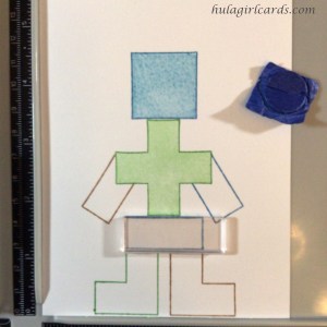
Because a lighter coloration was wanted for this focal piece in order to eventually offset one of the dark, two-toned backgrounds, second-generation stamping was used. All filler layers were positioned on the stamped outline. Prior to applying ink to the stamp, another sheet of A2 cardstock was positioned on top of the outlined image. The stamp was inked and pressed onto the secondary sheet. This first-generation sheet was then removed, and the stamp was impressed on the outlined sheet, the result of which was a much lighter coloration with a keenly visible outline. This technique resulted in two block persons, one dark with slightly more space between the blocks because of the lack of an outline and one light with an outline.
To fill each of these special-attention areas, masking was again needed. For the hips, the largest rectangle stamp was aligned with the outline’s left edge. On the cardstock, the right edge was masked. For the arms, the technique used on them previously of masking the horizontal corner of the plus sign was employed once more. After the full person was stamped with both layers, the inks were heat set. Facial features of eyes, smile, and dimples were drawn with a Pigma Micron black pen. Then, using a Sakura Clear Glaze pen, the entirety of the block person was covered with Glossy Accents-like clear ink. This protective layer took time to draw but yielded subtle, less dimensional sheen because the pen’s output is less prolific than Glossy Accents. The thin, shiny layer imbues warmth within the confines of the light shapes.
Because the block person has difficult-to-reach acute angles under the arms, dimension was added with foam squares rather than multiple cardstock layers. To combat any compression in the mail, some abandon was enjoyed when applying the squares. Having used few foam elements on the other eleven cards, some liberality of product seemed excusable.
The deep blue and green background provided a soothing backdrop for this stamped person. Rather than apply more ink to the card to darken the colors and draw attention to the background, dry embossing was employed to press the shapes into the paper. First, the background panel was temporarily adhered to the laminated stencil. Then, one of the cardstock stencils was taped to the front of the laminated unit for greater embossing dimension. After embossing, these pieces were disarticulated. Finally, the backing was removed from each foam square, allowing the person to be adhered to the panel just right of center.
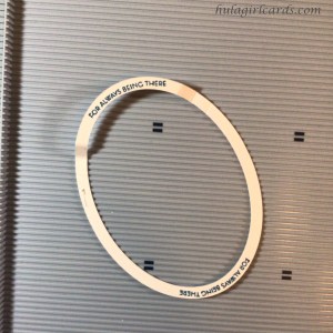
In the previous tutorial set’s positivity card, oval frames were set aside for future use. After placing a frame in the stamp positioner and topping it with the protective sheet of lamination, the sentiment “for always being there” from Altenew’s Build-a-Flower: Fuchsia stamp set was positioned at a slight curve. If one side proves stubborn, a second option is to close the positioner to transfer the stamp to the hinged lid and shape the stamp on that surface. The lid can be closed to audition the curve. If needed, both the top and bottom curves of the portrait-orientation oval, as well as each side – front and back – can be used. The sentiment was stamped in Dusk ink, and the best impression was chosen and auditioned on the block person. With the apex of the sentiment’s arch centered on the block individual, small tick lines were written in pencil on the oval to mark the edges of the block hands.
The tick marks were positioned parallel to the groves of a scoring board and scored with a bone folder. After measuring 3/8″ from the initial scores, another mark was scored. The measurement was repeated from the second groves in order to score a third line on each side of the sentiment. These lines help produce a three-dimensional banner with a pop-up detail by mountain folding at the scoring marks closest to the sentiment, valley folding at the second, and cutting along the third. This ensured that the sentiment stood up rather than receded into the block person and uniformity in size. If a larger pop-up dimension is wanted, alter the distance between scoring lines.
After adding small foam squares under the banner’s tips, the banner was placed on top of the bottom half of the oval, matching the curves. The unscored oval was clipped along the sentiment’s first score lines. This fragment was adhered to the back of the banner for added support.
Should the banner’s placement require repositioning after being adhered to the block person, the layer of clear glaze provides some forgiveness in placement. The foam adhesive is more likely to release from the glaze without marring the focal image than from unprotected cardstock. To adhere the banner, the release paper was removed from the foam squares prior to compressing the folds. Placing the banner on the focal body in its closed position ensured that the banner will compress without distortion inside the envelope. In order to showcase the accent heart, the banner was placed on the card’s background layer just at the edge of the hands. When the banner pops up, it looks as though the block person is holding the banner while the tails drape from the hands.
After securing the banner to the accent body, two additional details were needed to convey the warmth and sincerity of the sentiment. Like the Tin Man, no stout person made of wood is complete without a heart. To that end, the outline square with an inscribed heart – in the geometry sense, not the etching sense – was stamped onto a die-cut square, previously cut when creating the stencil. The shape was then lightly ink blended with residual ink from prior stencil work and fussy cut along the outline.
This square, adhered to the center of the plus sign torso, became the perfect resting spot for a reused element. In the Sending Hugs Wreath post, this blog’s second post and first work for the AECP, multiple hearts were made, but only two were used for the cards in that entry. The remaining two have been saved on a full-adhesive Post-It Note and taped to the container holding Altenew stamping supplies for some future use. As a refresher, this heart was created by die-cutting a heart from the Snail Mail die set and coloring it with a Crimson Artist Marker. A Tonic Aqua Shimmer Pen was brushed on the surface and sealed with Glossy Accents. This heart was glued and placed on the plus sign’s new center square, completing the card.
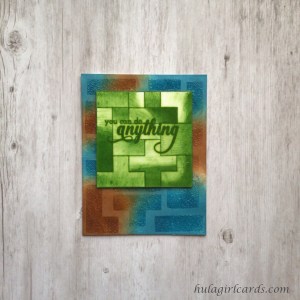
The positivity card features a striking, ombre tile of interlocking shapes atop a mottled blue and brown background with textured sheen.
The unexpected often visits creative efforts, offering a moment of adaptability and mental agility. When creating and embossing the accent panel to match the card’s background, the tile was unsalvageably ruined for use on a card. Rather than discard the piece, the embossing was heated and transferred to previously-used printer paper sheet so the tile could be saved for use as a template for the second attempt. For increased positioning ease, the template was temporarily adhered to the back of a laminated grid with one-third A2 markings, the creation of which was discussed in the feminine tutorial’s kindness card.
The above photo is from the first stamping, that which became the template. For the tile featured on the card proper, the look of embedding the sentiment in the tile was desired. A glaze would encase the tile and sentiment rather than allowing the sentiment float on the surface. “You can do anything” from Altenew’s Fancy Greetings stamp set was aligned on the template-backed laminated grid with care taken to ensure the words were as uninterrupted as possible by the pattern’s outlined shapes. The sentiment was stamped three times on the cardstock with Mountain Creek ink for a fully saturated, dark impression.
Both outline and filler layers were required to create this tile. Prior to having a template from which to work, a block with an L-shaped inside corner was chosen for the first stamped image. The inside corner created by the perpendicular shape offered two sides with which to align the subsequent outline, ensuring a tile with definite right angles. After stamping the first shape, the others were positioned with use of the protective lamination sheet. When working with the template, the gridded lamination served as a substitute for the oft-used protective sheet. The stamps were aligned with the template, and all shapes were stamped with Shadow Creek ink.
To position the second layer’s filler stamp, only the protective sheet was used. The filler layer is the only interior layer in the Build Blocks stamp set. In order to add more interest to the tile and create a sense of more numerous interior layers with increasingly dark details, each shape was impressed multiple times with varying techniques to achieve an ombre look. For the lighter portions, some shapes were blotted with a towel, which added the weave’s texture to the stamping. Others were wiped with a towel for a smoother look. Sometimes, ink was applied to the stamp with a circle motion, while others featured swiping in one direction. Textural consistency was maintained for each block as layers were added for greater depth of color. By removing ink from increasingly more surface area of the stamp, a gradation of color appeared with each impression. The ombre pattern was uniform within the shape, but rotated when viewing the square as a whole.
After filling the tile with both outlines and interior details, the sentiment was stamped twice more on top of the previous stamping so that the sentiment would stand out against even the darkest portions of the ombre design. The sheet was heat set and trimmed to 3.25″. Three matching squares were cut from second-use cardstock. To create the look of a green tile, the edges for all layers were dragged across the Shadow Creek ink pad, and the penultimate top layer received intense ink blending around the edges in case any of that layer proved visible. While the precaution may have been superfluous, it ensured the intended look. The squares were then layered and set aside.
The Dusk and Milk Choclate-blended background was chosen for this card. Rather than achieve darker shades within the stencil’s opened channels with additional ink blending, shine, texture, and warmth were created with embossing. Prior to temporarily adhering the card front to the back of the stencil, the surface of the cardstock sheet was pounced generously with an anti-static powder tool. VersaMark’s Watermark ink was repeatedly pressed into the open channels for assured full coverage. After removing the stencil, WOW!’s Clear Gloss Ultra High embossing powder was sprinkled on the surface, the excess shaken away, and the remaining powder heated. Because this card front received only one application of a chunky embossing powder, the resulting texture is rich with bumpiness and brought great interest to the background. Once the panel cooled, liquid adhesive was applied to the back of the tile and adhered near the top of the background.
Glossy Accents was applied to the top one unit square at a time with particular care taken to leave no gaps. The previous line of Glossy Accents was touched with the nozzle’s tip and lightly mixed with the newest portion. As mentioned previously in the wahine perseverance card, dye inks can be reactivated by Glossy Accents. Using the product for this tile was an informed decision, and the feathered look it produced around the sentiment created the look of custom hand painting. Because the sentiment was added during the construction of the tile, no other work was needed to finish the positivity card.
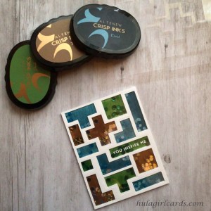
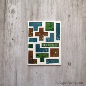
Playfulness softens humility in this shiny shaker card featuring the cardstock frames that started as handmade stencils. Occasionally when working on a project, a fortuitous moment arises. When creating this card, die-cut shapes that were superfluous found purpose in the perseverance card that follows this humble card.
To create this card, an A2-sized sheet of cardstock was adhered to the back of the laminated stencil. As all three colors of Dusk, Shadow Creek, and Milk Chocolate were desired in this background in crisply delineated shapes, care was required to ensure each opening received only the intended color. The die-cut shapes, which were the result of the cardstock stencils’ creation, were employed to fill the gaps. A ring of Easy See tape was placed in the openings of the shapes destined to be a color contrary to the one immediately blended. Die cuts were pressed on to the tape inside the channels. Then, with a larger blending brush, the respective color was blended over the surface of the stencil, creating softly blended colored shapes in the opening and on the die-cut shapes, which were removed and set aside for a future project. Three iterations of this technique were employed until all the channels were filled.
Hand stamping the interior layer with each coordinating shape was used to darken the blended color and add striations. Instead of applying ink with the proper pouncing technique, the ink pad was swept down the surface of the stamp so that a pattern of fine lines was transferred to the stamp and eventually to the background. All the stamps were aligned so that a vertical pattern emerged. This inking technique creates the look of brushed metallic cardstock with considerably less fuss than cutting shapes from three colors of paper.
Two of the three, reserved cardstock frames were individually adhered on top of the inked background and trimmed to an A2 card base size. Along the remaining cardstock edges, 1/8″ Scor-Tape was applied without removing the carrier strip. Then, green, blue, and brown flat sequins were added in the coordinating shape’s openings. A jewel picker and reverse tweezers were particularly helpful in selecting the appropriate embellishment from the mixture and transferring it the the shaped windows. The sequin pack used did not include blue sequins; instead, this shade was created with alcohol markers. With Altenew’s Dusk and Desert Night Artist Markers both sides of white and creamy sequin dots were altered to varying shades of blue. Though the silicone work surface had numerous blue marks, all were easily removed with stamp cleaner.
After removing the carrier strip from the double-sided tape, an oversized sheet of remnant lamination was adhered to enclose the sequins. The surface was then burnished with a bone folder and trimmed to 4.25″ x 5.5″. Care was once more required to apply glue to the slick lamination along the frame’s enclosures. This unit was then topped with the remaining frame and trimmed once more to match the base, which was adhered to a side-folding, A2 card base.
“You inspire me” from Altenew’s Painted Butterflies stamp set was embossed in one of the horizontal windows with WOW! Opaque Bright White Regular embossing powder after treating the area with an anti-static powder tool. Since the laminated layer was sandwiched between two carstock frames, no distortion of the embossed sentiment resulted, allowing the letters to remain clean and crisp.
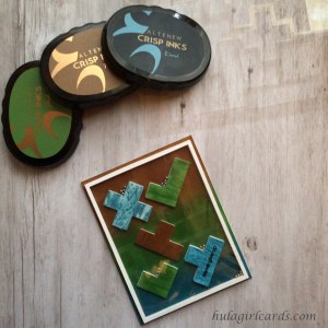
Inspired by pachinko, a favored child’s game that belongs in the pinball family, this interactive card will prove quite the entertaining diversion for the recipient. The perseverance card’s background features three blocks of ink-blended Dusk, Shadow Creek, and Milk Chocolate with subtle tone-on-tone stenciled blending, too. The result is an unobtrusive background with swaths of color that offset the pachinko elements.
Five of the blended, die-cut shapes from the masculine set’s humble card were chosen for their various inside corners and auditioned on the background with a contrasting color placement. As a proof of concept, each shape was spaced to avoid a border frame and rotated so that one inside corner became a cup to catch metal balls. A photo was taken to aid later assembly.
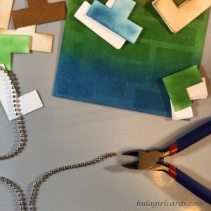
Approximately twenty metal balls were liberated from a ball chain lanyard, creating another recycled element within these card sets. Wire snips had no difficult in cutting the thin wire between each ball, and the loose orbs were kept in a small container until needed. The remainder of the lanyard was used to determine how many die-cut layers were necessary to allow uninhibited movement of the balls. One shape was stacked and placed adjacent to the chain. Then, the die cuts were weighted with an acrylic ruler. Additional were pieces were added until the chain could move freely. For this particular ball chain lanyard, seven layers were needed. Of the white die cuts, six layers were adhered together. When needed, additional shapes were cut from second-use cardstock.
To simulate the look of a wooden veneer, a corresponding ink color was applied to Altenew’s “A Walk in the Wood” wood grain background stamp. Then, with the aid of an acrylic block, the uninked interior layer was pressed onto the surface of the wood grain stamp prior to impressing the ink-blended shape. This kissing technique transferred the wood grain pattern to the die-cut shapes. By changing the inked position of the background stamp, variations were added to the look of the game pieces. These shapes were glued on top of the stacked blocks and became the seventh layer that would allow the balls free range of movement.
Though A2 nesting rectangle dies would also work, a Cricut paper cutting machine was used to cut a narrow 1/8″ frame that measures 4″ x 5.25″. This frame size will produce an 1/8″ border outside the frame where the background will be visible. Seven frames were cut from second-use cardstock, stacked, and adhered. The eighth was cut from a clean sheet of cardstock. The resulting rectangles were set aside for some future use.
To assemble the game, the stacked frame was adhered to the background, leaving an even 1/8″ border on all sides. After consulting the placement photo, the seven-layer blocks with wood grain accents were placed within the game’s deck. Care was taken to space the blocks wide enough apart so that the balls could travel freely without getting stuck either between the blocks or between a block and the border prior to adhering the veneered shapes in place. This unit was weighted with an acrylic block and allowed to dry.
Next, 1/8″ Scor-Tape was placed along the top of the frame, and its backing paper was removed. After adding the numerous metal balls, a remnant sheet of empty lamination, also measuring 4″ x 5.25″, was adhered, creating a window. Adhesive was added to the back of the final frame and it was adhered on top to conceal the lamination’s adhesive. Approximately twenty balls were used in this game. If more are desired, add them prior to enclosing the game deck with laminated plastic.
To some, the sentiment “never give up” from Altenew’s A Walk in the Woods stamp set may seem especially goading in the context of a game, but the sentiment encourages the realizing of goals and evokes a sense of cheering the recipient toward them. After choosing one of the block shapes to showcase the sentiment, a matching, previously blended die cut was pressed into service. It received the same wood grain treatment prior to stamping the sentiment in Altenew’s Obsidian pigment ink. The canted nature of these blocks-turned-panchinko cups allowed for the sentiment to be placed on the diagonal with respect to the card.
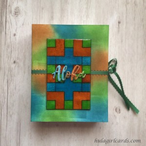
While some cards vibrantly proclaim their sentiment, this aloha card draws the eye vertically down the accent panel to reach a heart nestled inside two L-shaped blocks before wishing the recipient an enthusiastic aloha.
One of the more vivid, mottled backgrounds was chosen for this card. After attaching the background to the stencil, the open channels were blended with matching shades of Dusk, Shadow Creek, and Milk Chocolate with three I-Crafters Blending Brushes in corresponding colors. The effect creates shadowy blocks and a sense of depth, as if the background were some distance behind the stenciled shapes.
The accent panel features the repeated stamping of one shape: the tall L shape. Because the outlines were stamped in the same color as the interior layer of the block, space was needed between the stamped outlines to avoid muddying the ink colors. The edges of the stamp were used as spacing aid, though additional room was added to the aloha portion as if it lightens the density of the stamping above it.
The accent strip started life as an A2-sized piece of cardstock. By positioning the stamp along the vertical sides of the block, it was possible to rotate the cardstock a half turn after each impression, which created a secondary panel for some future project. Rather than use a second cardstock sheet for second generation stamping, the half-turn method was again employed. The first shape was impressed with first generation’s full intensity; then, the cardstock was rotated prior to stamping the second impression on a new, but corresponding shape. In this second generation position, the stamp was wiped with a dry cloth and repositioned with the aid of the protective sheet before stamping it anew. First and second generations alternated sides, and two panels with varied intensity, causing the outlines to wink in and out of focus, were created.
Finally, the outlined square with the inscribed heart was stamped in green prior to stamping the sentiment “aloha!” below it in Altenew’s Obsidian Pigment Ink. After trimming the panel to 1.5″ x 5.5″, it was adhered to two layers of second-use cardstock and glued 3/8″ from the left edge of the card front. The unit was adhered to a side-folding A2 card.
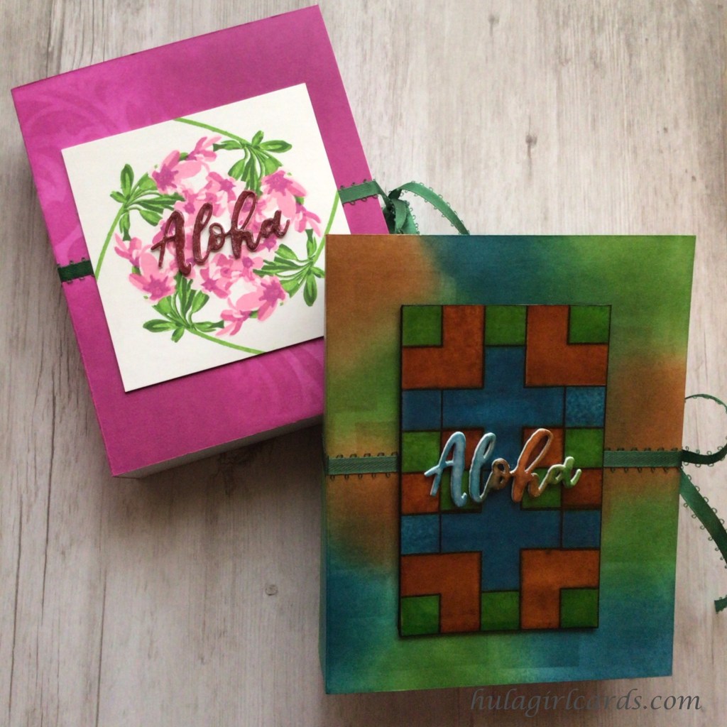
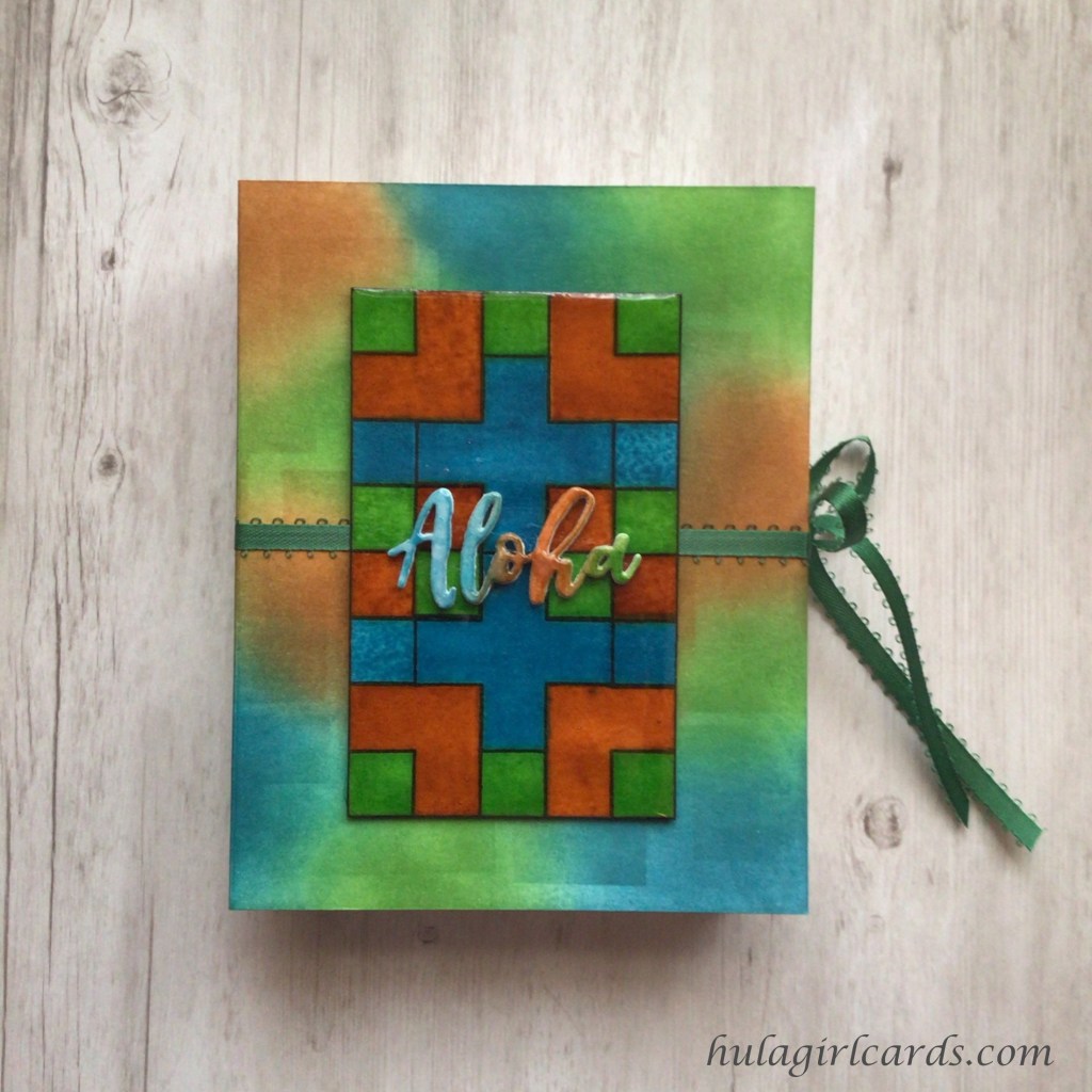
These book-style packages offer security for the custom card, but allow for the easy removal of cards. Sometimes, closed boxes act as an impediment to sending cards, and this partially opened decorative package makes it easy to peruse and select the cards inside. The deep interior ensures that these highly dimensional cards and their envelopes have ample room.
Construction
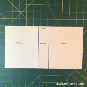
Two letter-sized cardstock sheets are needed to create this package. The exterior sheet was trimmed to 11″ x 6″. It was then scored along the 11″ side at 4 3/4″ and 6 1/4″ to create the front, spine, and back and was set aside. All the scored lines on the cover panel are fold lines, but were not folded until after the sheet was decorated. These lines were scored first to help guide the decoration process and did not inhibit ink blending.
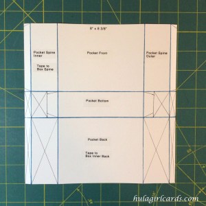
The interior pocket will provide structure and support for the package as a whole in addition to added protection for the cards. This sheet was trimmed to 8″ x 8 3/8″. Along the 8″ side, it was scored at 3/8″, 1 3/4″, 6 1/4″, and 7 5/8″. The 8 3/8″ side was scored at 3 1/2″ and 4 7/8″. These scored lines create wide, center boxes to hold the cards as well as long, slender rectangles to create depth, and narrow strips to which to apply adhesive. Two additional support pieces can be cut either from the remaining cardstock or second-use scraps with at least one clean side. These pieces measure 1 1/4″ x 4 3/8″ for the bottom’s reinforcement and 1 1/4″ x 3 3/8″ for the outer spine’s reinforcement. These areas will not be adhered to the packaging’s cover and are optional.
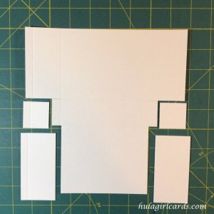
Though the interior panel had been scored, some excisions of the lower two-thirds were necessary. By aligning the convex scored groove with the concave channel of Fisker’s paper trimmer, the blade was used to slice the paper until the arrow markings on the handle denoting the blade’s tip align with the desired depth. In this instance, that depth is marked by an intersecting scored line. With the 8″ side aligned in the trimmer’s guide, the 1 3/4″ and 6 1/4″ lines were sliced from the bottom up to the lowest scored horizontal line. After rotating the paper with the 8 3/8″ side at the top, both scored lines were sliced from the outer edges to the second horizontal groove, the lines bordering the bottom of the pocket. In this orientation, each scored line received two partial cuts. Scissors were used to clip the small adhesive tabs on other side of what became the container’s bottom.
The above image shows which areas were cut away. With scissors, small wedges were excised from both sides of the the four tab areas – the narrow 3/8″ tabs and the tabs cut with scissors in the previous step.
Quarter-inch Scor-Tape was applied to each tab as well as the interior spine and pocket back as marked on the pattern. The interior spine will be reinforced by the cover’s spine, and the pocket’s back will adhere to the interior of the cover’s back. These double layers of card stock will create a sturdy package. After placing this unit adhesive side down, the bottom’s reinforcement strip was permanently affixed.
This piece was turned over once more to expose the papered adhesive strips, and all the remaining scored lines were folded into mountain folds and burnished with a bone folder. To assemble, the container was folded into its box-like shape, but only the tab adhesive strips were removed to secure the sides of the box. The carrier strips on the spine and back remained in place. If desired the side reinforcement piece can be added once the container has been assembled. After removing the carrier strips, the bottom edge of the reinforcement piece can be slid at an angle into the box along the inside face of the exterior spine and held in place with a bone folder as the remainder of the strip is tipped into position. After burnishing, the surfaces will remain adhered to one another. The box is designed for a snug fit between the container and the envelopes while maintaining enough room for the envelope to slide in the opening. A second reinforcement strip along the interior of the depth would inhibit this function.
Both packages feature heavy ink blending. To ensure the interior cover remained unblemished, three rings of temporary adhesive, placed on the front and back covers and spine, were applied to the side with convex grooves for added strength in gripping the work surface.
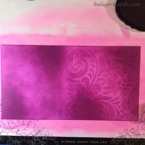
For the feminine card set, the cover received ombre ink blending of Purple Wine ink with the lighter portions positioned diagonally across the cover. The pre-scored lines helped inform this blending treatment. The stencil was taped into place with the right edge aligned with the right edge of the front cover with the swirling feather on the left. After lightly applying ink in the darkest areas and giving lighter areas a light-to-medium blending, the stencil was cleaned and flipped so that the feathered swirls became mirror images of one another. The back and spine received ink blending in the same manner.
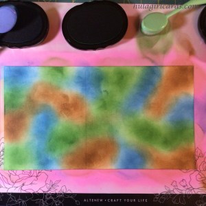
The masculine background was blended with ameboid shapes from all three inks that comprise its color scheme. After placing the initial splotches, the inked portions were intensified and overlapped with additional blending. This cover was also stenciled in a piecemeal fashion, but the stencil’s orientation was never flipped. Small blending brushes helped match the stencil’s blending with the background across the surface of the cardstock.
A gridded work surface is invaluable for applying double-sided adhesive straight across a long surface. With the open cover’s lower edge aligned along a grid line, the height’s midpoint, three inches, was found. Eighth-inch Scor-Tape was placed at the left midpoint and held with a finger while the tape was stretched across to the cover’s right boundary. Before fully placing the tape on the cardstock, the tape was aligned with the 3″ mark on the right. This ensured the tape’s placement was straight and even. With the release paper still affixed, the tape was burnished with a teflon bone folder.
Deep, forest green ribbon was chosen to accent both packages. On the masculine set, it appears woodsy, and on the feminine set, the ribbon contrasts beautifully with the blossom and blends with the darker green shades of the leaves and sepals. Approximately 35″ of picot-edge ribbon was portioned and cut. Then, its midpoint was found by matching the cut ends. Finger pressing the midpoint ensured the ease of matching that point with the center of the spine. With the midpoint in one hand and a single tail in the other, the ribbon was adhered to the cover in much the same fashion as the double-sided tape was, except this time, the midpoint was placed on the spine first. After smoothing the ribbon, the same process was repeated on the opposite side. The entirety of the adhered embellishment was gently burnished with a bone folder.
The cover was folded with mountain folds on the decorative side, the lines of which were made crisp with a bone folder. Despite the ribbon and adhesive encumbrances, the cover had no difficulty being folded along the previously scored lines.
Accents
The wahine set showcases two elements created earlier in the tutorial. The unembossed, uncut wreath from the humble card and the die-cut “aloha” sentiment from the aloha card. The 3.75″ wreath square was layered with two supporting, second-use cardstock squares. With a Rose Quartz Artist Marker, the unit’s edges were rendered light pink. The wreath was adhered to the center front cover of the package and weighted with an acrylic block as it dried.
Only two die-cuts had been stacked for the sentiment. The loose sentiment was colored with a Coral Berry Artist Marker and adhered to the stacked word. After gluing the sentiment to the center of the wreath, the letters were brushed with Tonic Aqua Shimmer and glazed with Glossy Accents.
Though many accent pieces remained for future projects from the kāne set, none had the focal presence to coordinate with the feminine packaging. A new tile was created with similar techniques to the one made for the masculine positivity card. This time, symmetry and crispness were explored. Using the cross, squat L, and square outline stamps, a symmetrical geometric design was stamped with Altenew’s Obsidian pigment ink. To avoid smears, each stamped outline was lightly heat set before applying the protective sheet, preparatory to positioning the next stamp. The stamps were wiped with a dry cloth after each impression and only needed to be properly cleaned once for renewed cling. The interior layers were stamped with Milk Chocolate for the squat Ls and Dusk for the plus signs. The squares alternate between those two colors in addition to Shadow Creek.
This panel was trimmed to 2 3/4″ x 4 3/8″ and adhered to two supporting layers. All the edges were brushed with a Jet Black Artist Marker After gluing the panel to the cover, Glossy Accents was generously applied to the tile’s surface. Because pigment ink was employed to delineate the the borders of each shape’s colored interior, the inks did not bleed even when activated by Glossy Accents.
The final “aloha” sentiment was lightly ink blended in all three colors with an intensity that matched the cover and contrasted with the tile, the latter of which received entirely first-generation stamping. As with the feminine set’s sentiment, this aloha was layered and adhered to the dried tile and brushed with Tonic Aqua Shimmer before applying Glossy Accents.
Assembly
With the bottom of the box on a flat surface, the spine’s adhesive was exposed and married to the cover’s interior spine. The cover is just slightly deeper than the container portion, yielding a seamless fit. To strongly adhere one piece to the other, a bone folder was used to burnish the tape. Then, with the back cover in the open position, the container’s rear adhesive was exposed. Keeping the packaging standing on a flat surface, the rear cover was closed to align the bottom edges. With the cover laying on the surface, a bone folder was once again used to burnish the tapes. The ribbon’s tails were tied into a bow and trimmed even with the bottom of the package.
Once the packaging stands upright, it resembles a book. The front cover opens and has room for a personal message. The pocket’s height of just over half ensures that package will retain its shape when the bow is tied. That the container portion’s width is 1/4″ less than the outer cover creates the look of the pages of a hardback book sitting just inside the cover.
Even filled with six layer-rich cards and envelopes, the packaging retains room enough for a few more items before any danger of cramping can arise.
With a minimum of supplies – a stencil, a layering stamp set, ink – and a healthy dose of creativity and imagination, strikingly different card sets can be created with unifying elements. That these card sets spread aloha is an added boon.
Fortuitous ink pad experimentation led to the look of brushed metal cardstock without the monetary investment in this card, inspired by the Altenew course Irresistible Inking Techniques.
This trio of purple pansies from Altenew’s Simply the Best stamp set features three treatments of faux brushed metal cardstock. To create brushed lines on cardstock, swipe the ink pad down the surface of the stamp prior to impressing the stamp onto paper. Sweeping the ink pad in this manner results in fine, inked channels rather than the typical pouncing technique for even coverage.
The posies were stamped in Altenew’s Maple Yellow and their purple hues of Wisteria, Ultraviolet, and Andromeda. Each flower was brushed in a different way. One features the single-direction swiping technique and was layered with all with the brushed directions matching, which created the look of a single sheet of brushed metal cardstock printed with a pansy. The second flower was brushed with a cross hatched look. The ink was stamped in two passes, first with vertical swiping, then with horizontal on each successive layer. Because of the double stamping, this pansy’s color is more even and the texture of the stamping more subtle. For the final blossom, each layer was stamped with swiping in a different direction. The base layer features vertical swiping, the second layer has horizontal swiping, the third layer was swept diagonally from left to right, and the fourth layer diagonally front right to left. Though all the flowers consist of a single layer, this flower variation in particular causes the eye to question how many layers were used.
The card’s background is yet another example of brushed metal inking. To achieve even coverage across a card-front sized sheet of paper without the benefit of a stamp, Altenew’s Almond Butter was swiped vertically on a silicone mat. Then, the cardstock was pressed onto the mat and rubbed for even ink transfer while applying pressure with the opposing hand to hold the paper in place. To add more warmth to the resulting background, Almond Butter was blended onto the paper with a blending brush. This filled in any remaining white space and intensified the color while maintaining the brushed metal texture.
These flowers were fussy cut by hand and arranged in slight curve from the lower left to upper right portion of the card front. The “you are in my prayers” sentiment from Altenew’s Wildflower Garden stamp set was stamped on the upper left in Andromeda ink, the same color used for the darkest pansy layer. The sentiment almost appears to be nestled among an implied ring of flowers.
The dimensional, layered element of die-cut flowers adds a special touch to these cards, inspired by the Altenew course Easy Die Cutting Techniques.
These monochromatic tulips from Altenew’s Tulip Stamp and Die Set were made with a heavy concentration of Brusho’s Pigment Powder in commingled shades of teal and dark blue. In the above photo, the tulips on the right closely match Altenew’s shade of emerald, while the card on the left has deeper notes of blue along the petals. To create these flowers, the pigment powders were sprinkled on a sheet of Canson’s cold press watercolor paper and sprayed heavily with water. As so frequently happens when crafting, the unexpected arises. The surprise of having sprinkled too much powder meant that flexibility and creativity were needed to save an otherwise grainy project. After adding copious amounts of water, the excess color was sopped with a second sheet of watercolor paper, resulting in more die-cutting options later.
Once the papers dried and were cut to widths of six inches, the width of the die machine’s cutting plates, areas of deep color saturation were chosen for the die-cutting of several stems and blossoms. It is important to note that some of the watercolor pigment transferred onto both the dies and cutting plates, so additional care was needed to clean those items to avoid future, unintended color transfer. In order to stamp the interior details of the petals and leaves, the die cuts were temporarily adhered to a sheet of copy paper. Thus secured, the die-cut elements remained stationary for the positioning of the stamps. Impressions were made with both Hero Arts’ Unicorn White Pigment Ink and Altenew’s Obsidian Pigment Ink. Using starkly contrasting inks created shadows and highlights on these deeply saturated tulip silhouettes.
The tulip duo card features a background of tulip and posy blossoms, which were hand stamped sporadically over the card front with Altenew’s Seaglass Crisp Die Ink. Care was taken to ensure variation in the flowers’ orientation so that an organic sprinkling of flower blossoms was achieved. The closed tulip blossom has multiple layers, the base and interior layers of which were both stamped with Seaglass ink. This repeated stamping created a darker concentration of color on the interior impression so that no other ink colors were necessary.
The intended design for the background was a subtle tone-on-tone Seaglass color to complement the depth of the watercolor focal tulips. To this end, it was necessary to lightly pounce Unicorn white pigment ink with a blending brush on the background stamping to mute the layered colors so the deeper Seaglass shades lightened in intensity. A one-centimeter, five-petal flower from Altenew’s Vintage Flowers stamp set was used to fill the remaining white space of the card front’s background.
To create an outline around the first tulip shape, the dies were embossed with the aid of an embossing pad in the die-cutting machine’s layer sandwich. The die-cut tulip was adhered in the raised area, and a small halo from the impression of the die is visible around it. Then, three layers of die-cut pieces were layered with the blossom glued atop the tip of the stem. This method gave the flower a seamless look with a minimum of bulk, and the tulip acted as one piece when adhering it to the card front below the single-layer flower. The excess stem was removed with heavy paper shears after the glue set.
As a finishing detail, the “love” sentiment from the Tulip stamp set was embossed twice on the dimensional tulip with Wow!’s Opaque Bright White Regular embossing powder after preparing the surface with an anti-static powder tool. The double embossing smoothed the sentiment’s texture and increased the concentration of the white text, turning the sentiment into a meaningful focal point on the tulip duo.
The lush leaves of this solitary tulip were created by layering portions of multiple die-cut stems from three of the four stems in the die set. To create the mirror-imaged leaves, the die with the large leaf and stem were cut both on the front and back of the watercolor paper. Then, the upper stems were trimmed along the curve of the leaves. Interior stamping was again accomplished by temporarily adhering the die cuts to copy paper. The mirror image element, however, was mirror stamped by stamping the detail layer on a thin silicone mat. The mat was then turned over, carefully positioned, and pressed onto the die-cut leaf, transferring the inked impression.
To build the flower, the straight stem was adhered to the blossom, and the height of the resulting unit was auditioned on the card front and glued into place. Then, three leaf die-cuts were layered on top of the stem, effectively lengthening the flower unit. Alterations, such as trimming stems and shading layered areas with pigment ink, were made as needed until a full tulip stalk emerged.
Stamped with Altenew’s Obsidian Pigment Ink, the sentiment “you matter” from their Fancy Greetings stamp set occupies the lower third of the card beside the flower. The card front was trimmed to 4″ x 5.5″ and glued on top of thin border strips of dark blue mirror cardstock, which highlights the deep blue tones in the watercolor. Midnight blue rhinestones were added in a diagonal, triangular placement, cascading down the tulip and around the sentiment.
The layered beauty of three die-cut tulips brings added interest to these cards of encouragement.
Mirror image stamping of focal elements helps to create a poignantly sweet card, inspired by the AECP course Seasonal Scene Building.
Foxes from the Altenew’s Modern Fox Stamp Set face one another even though the stamp set contains only one fox. To accomplish this mirror image technique, a stamp positioner was used to impress multiple foxes facing both directions. The mirror image fox was stamped first on a silicone craft sheet, which was placed in the corner of the stamping tool. Then, a A2 sheet of cardstock was placed on top of the silicone mat, making certain to align it in the corner, too. When the stamp positioner was closed, the fox’s various layers were impressed on both sides of the paper. By aligning the die with the second generation fox’s image on the right side of the paper, the mirror image was easily cut at the same time. To remove the marks from the die and flatten the paper, the fox was passed through the die cutting machine without any die. Foxes were stamped in two colorways with Altenew’s Milk Chocolate and Snapdragon for the body and Obsidian Pigment Ink for the face and legs.
Using Gina K. Design’s Masking Magic, the snowy hill was masked by cutting a series of gentles curves freehand and adhering the mask along the bottom of a landscape A2 card base. To create the cloudy sky, Altenew’s Starlight Ink was applied to a blending brush and then lightly brushed in a haphazard fashion.
After removing the mask, the fox die cuts were adhered to the card front so that they face one another and overlap, suggesting an embrace. Snowflakes were added by sprinkling white paint from Kuretake’s Gansai Tambi Watercolor Palette. A heavier concentration was sprinkled around the foxes to create the sense of time, which when combined with the “Sending Hugs” sentiment from Altenew’s Fancy Greetings Stamp Set underscores the length of the encouraging embrace despite the winter snow.
Stencils lend themselves to versatility of techniques and media. Today’s cards share many similarities, such as palette, sentiment, and stencil, even though they read as entirely different cards. The changes of layering stencils and embossing powder produce strikingly impactful variations in these cards, inspired by the AECP course Celebration: Stencil Techniques.
For the first card, watercolor paper was cut to an A2 card front size and adhered to the back of Altenew’s Elegant Swirls Stencil. Using Pink & Main’s Ergonomic Blending Brush, Altenew’s Velvet Ink was lightly brushed into the stencil’s openings until a medium shade of red was achieved. Using a dry cloth, the excess ink was removed from the stencil. Altenew’s Molded Lines Stencil was laid over the first stencil and taped onto the work surface, Altenew’s Crafter’s Essential Stamping Mat. A heavier layer of Velvet was brushed into the composite openings of the two stencils, creating a background of gently curved striations within the original blending. The background was trimmed to 4″ x 5.25″ and adhered to an A2 card base.
The embossed card requires two layers for a stained glass effect. After creating the card base, the backing was masked along the fold line and adhered to the work surface in an open position. Then, a heavy blend of Velvet, Crimson, and Marigold were applied to the card front until the colors seemed to glow with fiery intensity.
To create the vellum overlay, the Elegant Swirls Stencil was placed face down on a blotter sheet of copy paper, and VersaMark’s Watermark Stamp Pad was pressed onto it. While either side could have been used, applying ink to the front of the stencil would have made this card a mirror image of the striped card. By inking the back, both cards match. Then, a generously-sized sheet of vellum was prepared with an anti-static powder tool. The stencil and vellum were carefully layered in a die sandwich and passed through a die cutter so the ink transferred from the stencil to the vellum. While rubbing the vellum against the stencil was another option, the results from the die cutter were more consistent.
After pouring Wow!’s Primary Ebony Embossing Powder onto the vellum, the sheet was set with a heat gun and trimmed to an A2 card size. Because ink was applied to the stencil rather than inside the stencil’s openings, the transferred ink rests along positive areas of the stencil. The vellum’s black portions match the stencil, leaving the openings into which a medium is typically applied translucent. Glue was applied to the underside of the black channels, which enabled the vellum to adhere to the blended card front with a seamless look. No glue was visible from the front. The combination of the vellum’s translucency and the intensely blended background yielded a card that glows with subtle, flame-like color variations.
Finishing details for these cards are similar with subtle differences. Both cards feature a die-cut “love” sentiment from Altenew’s Circled Sentiments Stamp Set and vellum backing from various portions of Altenew’s Fancy Frames Die Set. The striped card’s sentiment was stamped with Altenew’s Obsidian Pigment Ink and embossed with Wow’s Clear Embossing Powder. To soften the die cut’s white rim and transition to the watercolor paper, two vellum circles from the larger of the two frames were cut and layered with a drop of glue in the center of the circles. The embossed “love” was glued on top, and a trio of red gems were added around the sentiment.
For the stained glass card, the same sentiment was stamped in layers of the three inks that comprised the background’s blend, Velvet, Marigold, and Crimson, which hints at the intensity of the background prior to adding vellum. The sentiment’s vibrancy becomes the focal point against the muted vellum background. Once again, to soften the transition from white to the card proper, a single layer of a vellum-cut backing was added behind the sentiment, using the smaller wreath in Fancy Frames. The frame’s picot perimeter suited the feathered background more than the stark contrast of a crisp geometric shape would have.
Shimmering stars from mica-infused watercolor and glitter embossing powder enhance the galaxy background of this card, inspired by the AECP course Let it Shine.
Images of nebulae, particularly that of the Orion Nebula with its pink and purples hues, helped in deciding the card’s palette. Altenew’s Crisp Dye Ink colors of Purple Wine, Starlight, and Ultraviolet were chosen to create the atmosphere of looking out from within the nebula. Using Altenew’s Crafter’s Essential Stamping Mat and Pink & Main’s Ergonomic Blending Brush, large swaths of blue were applied to the card front. Since Starlight covers the largest area, it was necessary to angle the blending brush and use a sweeping motion to blend pink and purple in the remaining, narrow spaces, creating a subtle blend.
Once the background was sufficiently vivid, golden droplets of white, blush, and gold proper were splattered on the surface, using Kuretake’s Gansai Tambi Watercolor Palette. The paint was sprinkled by tapping the brush against a finger, making certain to change the distance from the card front for sizing variety. Nebulae are also called star nurseries, and this layered, shimmering, splattered effect produced great celestial fecundity, enabling the card to embody this moniker. The large, white gold droplets seemed too intense for the background, so they were softened by mixing the remaining white gold on the brush with the leftover Starlight on the craft mat from the earlier ink blending. The resulting color was applied to the partially set, white gold discs with the lightest touch from the brush’s tip. This altered the tone of the paint from bright white to pale blue and underscored the gaseous illusion of being surrounded by the nebula.
Altenew’s Faceted Stars background stamp added another layer of subtle beauty. After preparing the card front with an Embossing Buddy, the stamp was inked with VersaMark’s Watermark Stamp Pad and impressed on the paper. Then, Wow!’s Clear Sparkle Embossing Glitter was sprinkled on the blended background and embossed with a heat gun. This starry lattice glistens in and out of focus as the embedded glitter glints in the light and offsets the multi-toned background’s cosmic effect.
To finish this card, the same stamp set, Faceted Stars, was used to cobble together the sentiment “live a life full of wonder” and stamp it on a one-inch strip of card stock with Altenew’s Obsidian Pigment Ink. The strip was placed at a shallow angle along the lower third of the card front. After trimming this focal front to 4″ x 5.25″, it was applied to a sheet of craft foam prior to gluing the dimensional grouping to an A2 card base. While it isn’t necessary to travel to the farthest stars to live a life of wonder, this card encourages the recipient to see the sublime in the simple aspects of life, which might otherwise be taken for granted … to look up and enjoy the natural beauty, not just of the stars, but one’s proximal environs, too.
What better blessing could there be for an avid cyclist than wishing him endless days of sunshine-filled cycling weather? Imaginative uses of a linear stencil and layered rose stamps are the key features of this card, inspired by the AECP course For the Guys, which sends sunshine on the rainiest of days to any cyclist.
The versatility of Altenew’s Molded Line Stencil is exhibited in the rolling, grassy hills and rays of the sun in today’s landscape card. To create the hills, the stencil was canted, placed at an angle on the cardstock, ensuring a gentle slope to the land. To protect the paper, painter’s tape was applied along the topmost hill line, and Altenew’s Shadow Creek Ink was heavily brushed in the stencil’s open channels. After removing the stencil, a medium layer of the same ink was blended in the remaining white space.
To create the depth of the second hill nestled in the background, the stencil was canted and taped in the same manner as the first with additional tape along the first hill’s exposed contour. This time, blending included a base layer of Altenew’s Maple Yellow Ink prior to a much lighter coating of their Grass Field Ink. The resulting white lines were once again blended over after removing the stencil; then, the hills were cut as one piece. Though this could have been a masked, one-layer card, a multi-layer format was chosen for added subtlety of depth and interest.
The sun’s rays, the second creative use of the Molded Lines Stencil, were achieved through straightforward stenciling and fussy cutting. The stencil and paper were temporarily adhered with painter’s tape, and Altenew’s Maple Yellow and Snapdragon inks were blended in the openings with greater intensity towards the narrow end. Because the rays originate at the orb of the sun and radiate outward, it was necessary to fussy cut the ink blended lines and arrange them, with orange tips touching, on a card front-sized foundation sheet of cardstock, which had been lightly and haphazardly blended with Altenew’s Tide Pool Ink to create the look both of sky and clouds. The alignment of these five rays enabled their yellow ends to become part of the horizon line where the sky meets the light green hill. These rays almost sink behind this hill, creating the illusion of great distance.
The tree’s leaves were created with the smaller of the two blossoms, measuring just under 1.75 inches, in Altenew’s Antique Roses stamp set. On a separate sheet of cardstock, the base layer was stamped with Grass Field Ink in an overlapping, triangular formation, rotating the stamp each time. Because the fourth layer lent itself more to leafy density than the intervening layers, it was stamped a plethora of times with Shadow Creek Ink. Once again, the stamping was frequently overlapped and rotated without regard to staying within the triangular impressions of the tree’s crown. Using the remaining ink on the blending brush from coloring the hills, Green Fields was applied around the perimeter of the crown in order foster greater flexibility in the fussy-cutting process, with the added benefit that some of the stamping that fell outside the base layer could be used, too. The building of layers with the base and pseudo-leaf images created great movement and the impression of a flourishing tree on a summer day, as well as being an example of using stamps in unexpected ways.
The wood grain of Altenew’s A Walk in the Woods stamp set provided the perfect texture for the tree’s trunk, which was stamped and deeply blended with Altenew’s Milk Chocolate Ink. Using a hand-drawn guide with a gentle taper from wide to narrow on the back of the paper, the trunk was cut out and glued to the back of the tree’s crown. Care was taken to cut with a rough line along the root end of the trunk.
Altenew’s Artist Markers were used to color the focal bicycle, from their Shadow Play stamp set, in tones of gray: Limestone for the seat, handlebars, and spokes; Silver Stone for the frame; Pure Graphite for the tires. To help the bicycle blend into the landscape, the areas between the spokes, frame, and gears were shaded with Bamboo and Forest Glades for the grass and Dark Chocolate for the trunk. After fussy cutting the bicycle, the edges were shaded with Pure Graphite so none of the paper’s original color would be visible. The metal frame was coated with a Sakura clear glaze pen for an added metallic sheen.
To finish the card, the cut edges of the hill, rays, and tree were pulled against their matching blending brush prior to layering the landscape scene with the sun’s rays behind the hill duo. This detail of coloring the edges of the cardstock allowed the layers to transition cohesively into one another without interruption. After adhering the focal tree and bike to the foreground, Silver Stone was used to draw their shadow on the grassy hill before them.
Both “Wishing You” from Altenew’s Faceted Stars stamp set and “Sunshine” from Shadow Play were stamped with Simon Says Stamp’s Intense Black Ink in the upper right corner of the scene. After tidying the edges, the card front was adhered to a 5.25″ x 5.5″ card base, the border of which frames this charming scene of a bicycle leaning against a tree. One can almost imagine the cyclist taking a short break to enjoy the countryside before beginning the journey home.
A jewel-tone, swirling feather creates a striking backdrop for this card, inspired by the AECP course Easy Ink Blending Techniques.
This card’s background features Altenew’s Elegant Swirls Stencil coupled with their Crisp Dye Ink colors Ultraviolet and Tide Blue. The latter color was chosen to highlight the focal feather, while purple was chosen for the motifs surrounding it. Correct application of background blending was achieved by auditioning stencil placement prior to blending. Then, using Altenew’s Crafter’s Essential Stamping Mat as a base and a Craft Ink blending brush, Tide Blue was applied to the card front with a very light hand where the feather would be. The mat held onto the paper so no added accoutrements were needed at this stage. The blended layers were slowly built until a soft gradation was attained, which faded into the purple areas. The same technique was used to blend Ultraviolet onto the card front so that very little blue and purple overlap where the background colors meet.
To ensure the stencil remained firmly attached to the paper, the card front was adhered to the back of the stencil with low-tack painter’s tape; the front of the stencil was secured in the same manner to the stamping mat. The same blending brushes were once again pressed into service to intensify the duo of colors along the stencil’s openings. A darker concentration of blue was used in the tight, circular swirls at the top left and bottom right of the feather. Then, the color gradually lightened in hue farther from those swirls along the median portion of the shaft and extremities of the vanes. For the purple portions, the blending is lightest where it merges with blue and most intense as distance from the blue plume increases. This gradation of both background and foreground creates movement and interest, as well as a third color where the blue and purple stenciled tones meld into one another.
Finishing details for this card include a shimmer vellum-backed sentiment strip and an “Aloha” die-cut sentiment from Altenew’s Totally Tropical stamp and die set. Intense ink blending was used to color the 1.25-inch sentiment strip with inverse coloration to the card front. On the card front, blue was more prevalent on the left and purple on the right. The opposite is true of the sentiment strip. This juxtaposition of color balances the card so that the eye moves along the focal feather and then is drawn to the final portion of blue on the right where the sentiment rests. The colored strip was adhered to a 1.5-inch piece of shimmer vellum and applied to the background.
“Aloha” was die cut three times from heavy cardstock and layered. Nuvo Aqua Shimmer was brushed onto the top layer, and glossy accents was applied and allowed to dry before adhering the sentiment to the card. The shimmer vellum peeking from behind the sentiment strip enhances the glittery aloha greeting. The vellum’s translucency transitions between the background and the colored strip, increasing the focal impact of such a deeply meaningful sentiment.